Canvas Documentation
Bubble Best Practices
v6.0
v6.0
  • Introduction
  • Key Features
  • What's New
  • Canvas Design System Figma File
  • CANVAS FUNCTIONALITY
    • Getting Started
    • Branding & Design
    • Marketing Pages
    • Page
    • Bubble Pages & Blocks
    • Roles & Permissions
    • Menus & Navigation
    • Data & Workflows
    • Emails & Alerts
      • Mail merge terms
    • Miscellaneous
      • Setting up two factor authentication
      • Cookie and consent banner
      • Setting your password policy
      • Set up Payment info on Account page
      • Loading screen
      • Configuring multiple languages
      • Customizing your app's portal page colors
    • Reference
      • Pages
        • Index
        • Product homepage
        • Marketplace homepage
        • SaaS homepage
        • About us
        • Pricing
        • Admin Portal
        • Account
          • Account deletion
        • Login
        • Legal
        • Reset Password
        • 404
      • Reusable elements
        • Header
        • Footer
        • Signup & Log in
        • Cookies Permission
        • Widgets
          • App security
          • Header Widgets
          • Workflow Widgets
        • Admin Portal
          • Admin analytics
          • Admin email & templates
          • Admin header & footer
          • Admin legal popups
          • Admin branding, setup checklist, and settings
          • Admin options app variables
        • Menu Focus Elements
        • Sidebar tab
      • Data types
      • Option Sets
      • Backend Workflows
      • Design standards
        • Manually Building UI
  • Canvas library
    • Updating asset RG data source
    • UI Patterns
      • Simple Dashboard Page
      • Product Marketplace Dashboard Page
      • Labor Marketplace Profile Page
      • Social Network Profile Page
      • Simple Events Search Page
      • Events Search Page
      • Ecommerce Search Page
      • Labor Marketplace Search Page
    • Page templates
      • Basic Bubble Marketing Page
      • Chat Messenger Page
      • Form Builder Page
      • Centered Profile Page
      • Left-Justified Profile Page
      • Standard page
      • Toggle Tabs Page
      • Menu Page
      • Mobile Menu Page
      • Video List Page
      • Horizontal Tabs Portal / Dashboard Page
      • Standard Portal / Dashboard Page
      • Simple Portal / Dashboard Page with Icons
      • Double Sidebar Portal Page Template
      • Search Page
      • Map Search Page with Toggle and Filters
      • Floating Map Search Page
      • Search Bar Page
      • Multi-Step Page With Progress Bar
      • Standard Multi-Step Process Page
      • Multi-Step Process Page with Sidebar
      • Gallery Profile or Product Page
      • Sidebar Profile Page with Tabs
      • 2-Column Menu Tabs Page
      • 2-Column Checkout Page
      • 2-Column Video Chat Page
      • Vertical Multi-Step Page Template
    • Blocks
      • Pagination
      • Monthly Calendar Scheduling Widget
      • No Reply Comments Thread
      • Nested Comments Thread (with Like and Reply)
      • Placeholder Group
      • List with Circular Progress Bar Repeating Group
      • Top Input Chat Widget
      • Bottom Input Chat Widget
      • Toggle Tabs Group
      • Single-Select or Multi-Select Pill Tabs Group
      • Settings Group
      • Order Confirmation Group
      • To-Do List Repeating Group
      • Title Group with Button and Filters
      • Product Details Group With Progress Bar
      • Listing details with Icons and Menu Focus Group
      • Week Daily Availability Group
      • Frequently Asked Questions (FAQ) Repeating Group
      • Dismissible Module
      • Video Group
      • About Group
      • Add to Cart Group
      • Full Width Map with Directions Link
      • Location Module (Map and Directions)
      • Drag and Drop Repeating Group
      • Infinite Columns Horizontal Scroll Data Table with Fixed First Column (Repeating Group)
      • Nested Data Table (Repeating Group)
      • Standard Data Table (Repeating Group)
      • Standard Data Table (Table Element)
      • Mobile-Friendly Data Table (Repeating Group)
      • Mobile-Friendly Data Table (Table Element)
      • Infinite Columns Horizontal Scroll Data Table (Repeating Group)
      • Infinite Columns Horizontal Scroll Data Table (Table Element)
      • Activity Feed
      • Social Feed
      • Nested Repeating Group
      • Advanced Form Inputs Group
      • Reviews with Ratings Summary and Images
      • Reviews Repeating Group with User Images
      • Reviews (Text Only) Repeating Group
      • Standard Repeating Group with Image
      • Search Bar Group
      • Listing Details Group
      • Post Group with Upvoting UI
      • Large Chart Dashboard Widget
      • Chart With Key Metrics Dashboard Widget
      • 2-Column Table and Key Metrics Dashboard Widgets
      • 2-Column Large Metrics Dashboard Widgets
      • 4-Column Large Metrics Dashboard Widgets
      • Main Image with Thumbnails
      • Centered Profile Block
      • Left-justified Profile Block
      • Tile Image Gallery and Popup
      • Image Feed with Nested Comments Thread
      • 1-Column Standard Form Inputs Group
      • 2-Column Slideshow Tiles Repeating Group
      • 2-Column Repeating Group (Text, Link, Image, and Description)
      • 2-Column Repeating Group (Link, Text, and Button)
      • 2-Column Repeating Group with Actions
      • 2-Column Grid Tiles Repeating Group
      • 2-Column Form Group
      • 4-Column Tiles Repeating Group
      • Expiration timer
    • Popups
      • Edit Drawer
      • Map Location Details Drawer
      • Details and Comments Drawer
      • Confirmation Popup
      • Message Popup
      • Image Popup
      • Video Popup
      • Vertical Scroll Popup
      • Permissions popup
      • Multimedia Slideshow Popup
      • Edit Popup
      • Standard Form Popup
      • Subscribe Popup
      • Feedback / Contact Popup
      • Details Popup
      • Add List Popup
      • Advanced Form Popup
      • Rating Popup
      • Toggle Tabs Popup
      • Share Popup
      • Multi-Step Popup
      • Invoice Popup
      • Stripe Credit Card Purchase Popup
      • View Profile Popup
      • Send Message Popup
      • Multi-Select Pill Tabs Popup
      • Net Promoter Score (NPS) Popup
      • Pricing Plans Popup
    • Reusables
      • Multimage uploader
      • Sidebar_icontab
      • Doublesidebar_tab
Powered by GitBook
On this page

Was this helpful?

  1. CANVAS FUNCTIONALITY
  2. Miscellaneous

Loading screen

PreviousSet up Payment info on Account pageNextConfiguring multiple languages

Was this helpful?

The loading screen element allows you to display a loading animation while your page's elements and data are being loaded beneath. You will want to include this on every page where you want this behavior.

The element can be found under Visual elements.

Simply drag it on to the page in order for it to be active. No matter how large the element is, it will always take up the full width of the page. Make it 1x1 pixels and place it in the top right corner of the page to avoid responsiveness issues.
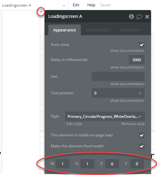
The properties panel provides several options for customizing the behavior and appearance of the loader.

There are two ways in which you can use the loading element.

1. Display by default on page load

If the element is set to be visible on page load, a loading screen will appear on the page until you explicitly hide it. In order to have it disappear once the page's elements are loaded, you can either:

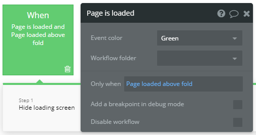
  1. Create a workflow which is triggered when the page is loaded & loaded above the fold. Attach the Hide loading screen action.

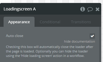
  2. Check the loading screen element's Auto close option
2. Manually set when to show/hide the loader

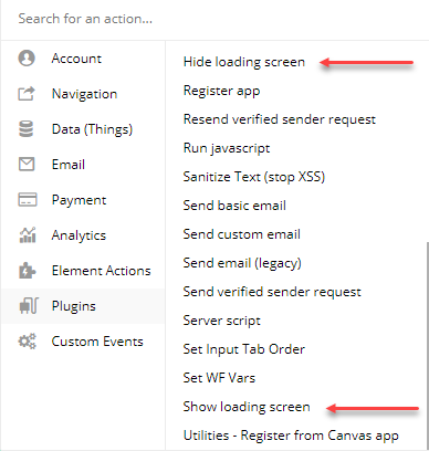
Under Workflow actions > Plugins, you have two loader actions, one to show the loader and one to hide it. Use these to show the loader while specific workflows are firing (i.e. while making bulk changes to a list).
Customizing the loader style
<lottie-player src="
https://s3.amazonaws.com/appforest_uf/f1622680371274x297542111769113480/lottie_loader2.json
" background="transparent" speed="1" style="width: 140px; height: 140px;" loop autoplay></lottie-player>

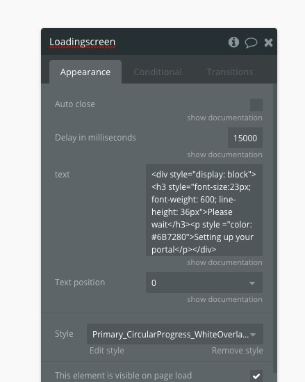
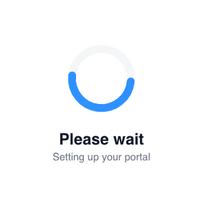
Updating the loading screen text Modify the code in the loading screen element's text field to tweak the font size, color, weight, line height, and description.

<div style="display: block"><h3 style="font-size:23px; font-weight: 600; line-height: 36px">Please wait</h3><p style ="color: #6B7280">Setting up your portal</p></div>

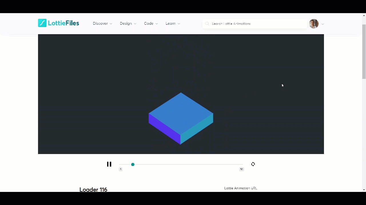
Updating the animation You can change the loader animation by pasting in a new animation json URL from (requires signup). Adjust the width and height in the code below to modify the size of the animation.
lottiefiles.com