# Settings Group
## Overview

This settings block includes a list of fields, each with an edit icon or a toggle.
## Structure
When this block is added to your app, it will be placed within a group called **Blocks container 860 (do not rename)** on the page. This group contains the responsive settings for all blocks.
* **Group Main header section - Settings**
This group contains common UI components such as a title, dropdown, toggle tabs, description text, sort dropdown, filters, and a 'new' button. For more information, please read our documentation [here](https://docs.airdev.co/canvas/canvas-functionality/pages-and-modules#customizing-block-title-group).
* **Group Main content group**\
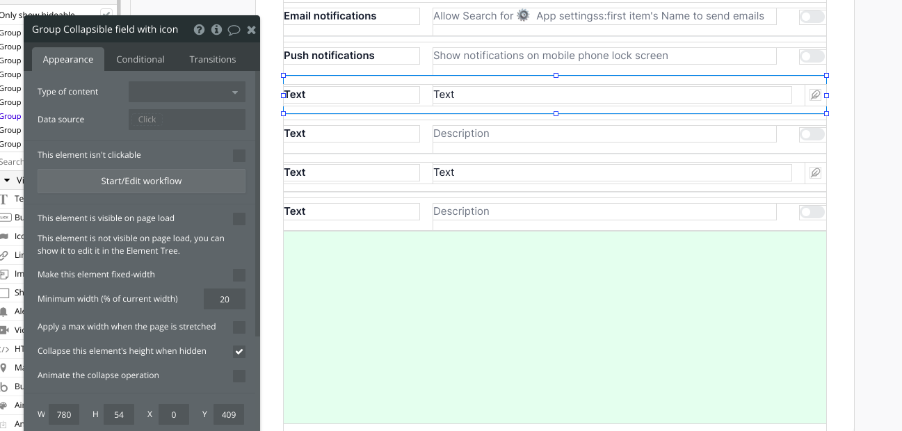
This group contains all the settings fields that a user can edit. There are two types of groups:
* **Group Collapsible field with icon**
This group includes a bolded title, description, and an edit icon. To edit a field, we recommend adding additional popups to the page with our Canvas chrome extension. Clicking on any of these fields should open separate popups where users can make edits to each corresponding field.
* **Group Collapsible field with toggle**
This group includes a bolded title, description, and a Canvas toggle. Please ensure your Canvas UI elements plugin is on the latest plugin version (Bubble editor > Plugins > Canvas UI elements). When the toggle value is changed, a workflow to trigger an AirAlert will fire.
* **Placeholder fields and groups**
We've included 4 hidden fields in the block and various green placeholder groups. To unhide a placeholder field, select the parent group and check the box for *This element is visible on page load*. To add more fields, simply resize the green placeholder groups to make space.
 ## How to set up
* Update the bolded title text and description text. We're using static texts for demo purposes but these should ideally be dynamic values.

* **Group Collapsible field with icon**
There are various placeholder workflows included in the block for when **Group Collapsible field with icon group** is clicked. Although not included in the block, we recommend using the Canvas chrome extension to add multiple Edit popups to the page. Once an edit popup is added to the page, you'd want to add additional workflow steps to these placeholder workflows:
*When **Group Collapsible field with icon group** is clicked then show **Edit popup***
* **Group Collapsible field with toggle**
Similarly, placeholder workflows are included for these groups as well. You would need to add an additional workflow step to the placeholder workflows:
*When **Canvas Toggle #** is changed then make changes to a thing in the database*
## How to set up
* Update the bolded title text and description text. We're using static texts for demo purposes but these should ideally be dynamic values.

* **Group Collapsible field with icon**
There are various placeholder workflows included in the block for when **Group Collapsible field with icon group** is clicked. Although not included in the block, we recommend using the Canvas chrome extension to add multiple Edit popups to the page. Once an edit popup is added to the page, you'd want to add additional workflow steps to these placeholder workflows:
*When **Group Collapsible field with icon group** is clicked then show **Edit popup***
* **Group Collapsible field with toggle**
Similarly, placeholder workflows are included for these groups as well. You would need to add an additional workflow step to the placeholder workflows:
*When **Canvas Toggle #** is changed then make changes to a thing in the database*
 ## How to set up
* Update the bolded title text and description text. We're using static texts for demo purposes but these should ideally be dynamic values.

* **Group Collapsible field with icon**
There are various placeholder workflows included in the block for when **Group Collapsible field with icon group** is clicked. Although not included in the block, we recommend using the Canvas chrome extension to add multiple Edit popups to the page. Once an edit popup is added to the page, you'd want to add additional workflow steps to these placeholder workflows:
*When **Group Collapsible field with icon group** is clicked then show **Edit popup***
* **Group Collapsible field with toggle**
Similarly, placeholder workflows are included for these groups as well. You would need to add an additional workflow step to the placeholder workflows:
*When **Canvas Toggle #** is changed then make changes to a thing in the database*
## How to set up
* Update the bolded title text and description text. We're using static texts for demo purposes but these should ideally be dynamic values.

* **Group Collapsible field with icon**
There are various placeholder workflows included in the block for when **Group Collapsible field with icon group** is clicked. Although not included in the block, we recommend using the Canvas chrome extension to add multiple Edit popups to the page. Once an edit popup is added to the page, you'd want to add additional workflow steps to these placeholder workflows:
*When **Group Collapsible field with icon group** is clicked then show **Edit popup***
* **Group Collapsible field with toggle**
Similarly, placeholder workflows are included for these groups as well. You would need to add an additional workflow step to the placeholder workflows:
*When **Canvas Toggle #** is changed then make changes to a thing in the database*