Canvas Documentation
Bubble Best Practices
v6.0
v6.0
  • Introduction
  • Key Features
  • What's New
  • Canvas Design System Figma File
  • CANVAS FUNCTIONALITY
    • Getting Started
    • Branding & Design
    • Marketing Pages
    • Page
    • Bubble Pages & Blocks
    • Roles & Permissions
    • Menus & Navigation
    • Data & Workflows
    • Emails & Alerts
      • Mail merge terms
    • Miscellaneous
      • Setting up two factor authentication
      • Cookie and consent banner
      • Setting your password policy
      • Set up Payment info on Account page
      • Loading screen
      • Configuring multiple languages
      • Customizing your app's portal page colors
    • Reference
      • Pages
        • Index
        • Product homepage
        • Marketplace homepage
        • SaaS homepage
        • About us
        • Pricing
        • Admin Portal
        • Account
          • Account deletion
        • Login
        • Legal
        • Reset Password
        • 404
      • Reusable elements
        • Header
        • Footer
        • Signup & Log in
        • Cookies Permission
        • Widgets
          • App security
          • Header Widgets
          • Workflow Widgets
        • Admin Portal
          • Admin analytics
          • Admin email & templates
          • Admin header & footer
          • Admin legal popups
          • Admin branding, setup checklist, and settings
          • Admin options app variables
        • Menu Focus Elements
        • Sidebar tab
      • Data types
      • Option Sets
      • Backend Workflows
      • Design standards
        • Manually Building UI
  • Canvas library
    • Updating asset RG data source
    • UI Patterns
      • Simple Dashboard Page
      • Product Marketplace Dashboard Page
      • Labor Marketplace Profile Page
      • Social Network Profile Page
      • Simple Events Search Page
      • Events Search Page
      • Ecommerce Search Page
      • Labor Marketplace Search Page
    • Page templates
      • Basic Bubble Marketing Page
      • Chat Messenger Page
      • Form Builder Page
      • Centered Profile Page
      • Left-Justified Profile Page
      • Standard page
      • Toggle Tabs Page
      • Menu Page
      • Mobile Menu Page
      • Video List Page
      • Horizontal Tabs Portal / Dashboard Page
      • Standard Portal / Dashboard Page
      • Simple Portal / Dashboard Page with Icons
      • Double Sidebar Portal Page Template
      • Search Page
      • Map Search Page with Toggle and Filters
      • Floating Map Search Page
      • Search Bar Page
      • Multi-Step Page With Progress Bar
      • Standard Multi-Step Process Page
      • Multi-Step Process Page with Sidebar
      • Gallery Profile or Product Page
      • Sidebar Profile Page with Tabs
      • 2-Column Menu Tabs Page
      • 2-Column Checkout Page
      • 2-Column Video Chat Page
      • Vertical Multi-Step Page Template
    • Blocks
      • Pagination
      • Monthly Calendar Scheduling Widget
      • No Reply Comments Thread
      • Nested Comments Thread (with Like and Reply)
      • Placeholder Group
      • List with Circular Progress Bar Repeating Group
      • Top Input Chat Widget
      • Bottom Input Chat Widget
      • Toggle Tabs Group
      • Single-Select or Multi-Select Pill Tabs Group
      • Settings Group
      • Order Confirmation Group
      • To-Do List Repeating Group
      • Title Group with Button and Filters
      • Product Details Group With Progress Bar
      • Listing details with Icons and Menu Focus Group
      • Week Daily Availability Group
      • Frequently Asked Questions (FAQ) Repeating Group
      • Dismissible Module
      • Video Group
      • About Group
      • Add to Cart Group
      • Full Width Map with Directions Link
      • Location Module (Map and Directions)
      • Drag and Drop Repeating Group
      • Infinite Columns Horizontal Scroll Data Table with Fixed First Column (Repeating Group)
      • Nested Data Table (Repeating Group)
      • Standard Data Table (Repeating Group)
      • Standard Data Table (Table Element)
      • Mobile-Friendly Data Table (Repeating Group)
      • Mobile-Friendly Data Table (Table Element)
      • Infinite Columns Horizontal Scroll Data Table (Repeating Group)
      • Infinite Columns Horizontal Scroll Data Table (Table Element)
      • Activity Feed
      • Social Feed
      • Nested Repeating Group
      • Advanced Form Inputs Group
      • Reviews with Ratings Summary and Images
      • Reviews Repeating Group with User Images
      • Reviews (Text Only) Repeating Group
      • Standard Repeating Group with Image
      • Search Bar Group
      • Listing Details Group
      • Post Group with Upvoting UI
      • Large Chart Dashboard Widget
      • Chart With Key Metrics Dashboard Widget
      • 2-Column Table and Key Metrics Dashboard Widgets
      • 2-Column Large Metrics Dashboard Widgets
      • 4-Column Large Metrics Dashboard Widgets
      • Main Image with Thumbnails
      • Centered Profile Block
      • Left-justified Profile Block
      • Tile Image Gallery and Popup
      • Image Feed with Nested Comments Thread
      • 1-Column Standard Form Inputs Group
      • 2-Column Slideshow Tiles Repeating Group
      • 2-Column Repeating Group (Text, Link, Image, and Description)
      • 2-Column Repeating Group (Link, Text, and Button)
      • 2-Column Repeating Group with Actions
      • 2-Column Grid Tiles Repeating Group
      • 2-Column Form Group
      • 4-Column Tiles Repeating Group
      • Expiration timer
    • Popups
      • Edit Drawer
      • Map Location Details Drawer
      • Details and Comments Drawer
      • Confirmation Popup
      • Message Popup
      • Image Popup
      • Video Popup
      • Vertical Scroll Popup
      • Permissions popup
      • Multimedia Slideshow Popup
      • Edit Popup
      • Standard Form Popup
      • Subscribe Popup
      • Feedback / Contact Popup
      • Details Popup
      • Add List Popup
      • Advanced Form Popup
      • Rating Popup
      • Toggle Tabs Popup
      • Share Popup
      • Multi-Step Popup
      • Invoice Popup
      • Stripe Credit Card Purchase Popup
      • View Profile Popup
      • Send Message Popup
      • Multi-Select Pill Tabs Popup
      • Net Promoter Score (NPS) Popup
      • Pricing Plans Popup
    • Reusables
      • Multimage uploader
      • Sidebar_icontab
      • Doublesidebar_tab
Powered by GitBook
On this page
  • Overview
  • Structure
  • How to set up

Was this helpful?

  1. Canvas library
  2. Page templates

Map Search Page with Toggle and Filters

Use this when the location of each result is most important.

PreviousSearch PageNextFloating Map Search Page

Was this helpful?

Overview

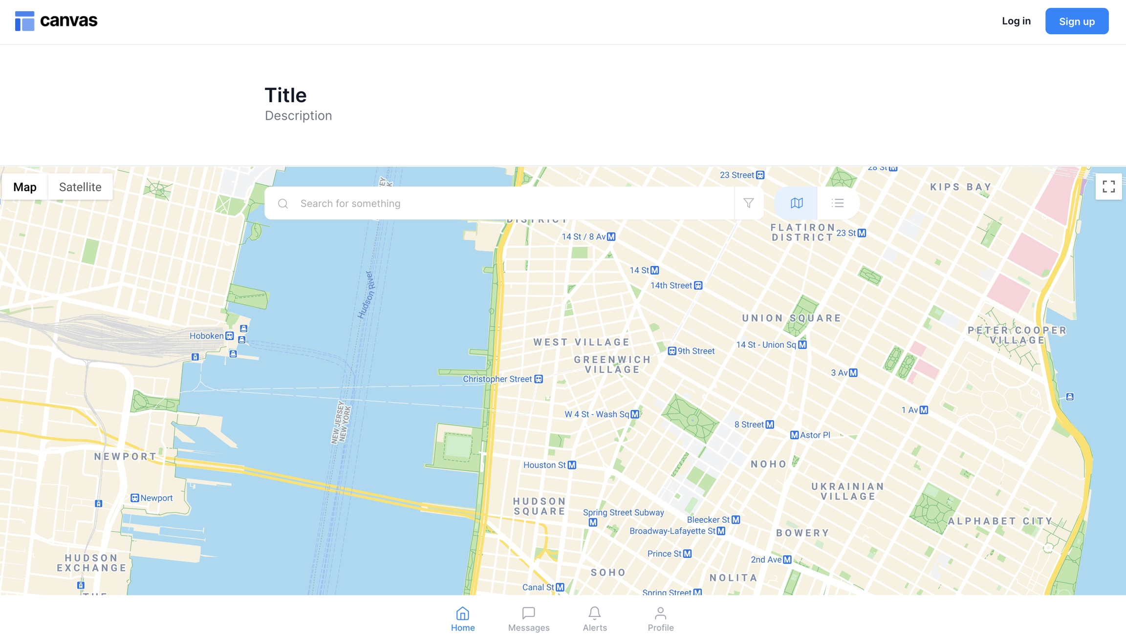
This page template includes a map component, a search bar with filters, and a toggle to switch between a map or a list view. Clicking on a map marker will open a modal with additional information.

Structure

When this page is added to your app, it will come with four main groups:

  • FloatingGroup Header This floating group contains the header reusable element and Group Main search bar and filters.

    • Clicking on Group Inner clear search will reset the search bar and clear the entered address

    • Clicking on filters_template will open a filter focus group

    • Clicking on Group Inner map tab_text or Group Inner list tab_text will set var - view map or list tab's data source to that group's text. This will change the current tab that the user is viewing.

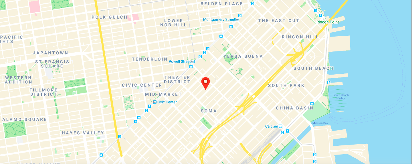
  • Group Main map tab This group contains the map element. It is only visible to the user when the toggle is set to the map view.

    • Clicking on a map marker will open Group Main map marker content_address where you can view more details about the selected location.
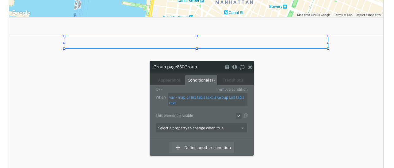
  • Blocks container 860 (do not rename) This group contains the responsive settings for all additional modules you would add to the page. It is only visible when the toggle is set to the list view.
This page will also come with one popup:

  • Popup Hidden Variables This popup includes various variables that are referenced in workflows or conditionals on the page.

    • var - Website object - This group stores the website object (e.g., app name, primary color, and etc.)

    • var - blank address - This group has a data source of type geographic address. It is used to reset the search bar and remove the entered address in the search input.

    • var - map or list tab - This group has a data source of type text. It is used to toggle between the map or list view and change which tab the user is currently viewing.

How to set up

  • Update the content of any additional blocks you've added to the list tab (Blocks container 860 (do not rename)). Please resize Group PLACEHOLDER so that it is not overlapping with any other elements.

  • Set the data source of Map and update the content in Group Main map marker content_address.

Please ensure the bottom of FloatingGroup Main bottom menu is always aligned with the bottom of the page (for responsiveness).

FloatingGroup Main bottom menu This floating group floats to the bottom of the page. It contains the Group Main map marker content_address and the .

For more information on how to use hidden variables, click .

Add or remove any filters in as needed. Please resize Group PLACEHOLDER so that it is not overlapping with any other elements.

Update the icons and texts in the as needed.

mobilemenu
here
filters_template reusable element
mobilemenu reusable element
Search bar, filters, and toggles
Map tab
Selected map marker view
Group where your additional modules will be added to
Bottom floating group content