Canvas Documentation
Bubble Best Practices
v3.7
v3.7
  • Introduction
  • Key Features
  • What's New
  • For Designers
  • CANVAS FUNCTIONALITY
    • Getting Started
    • Branding & Design
    • Marketing Pages
    • Bubble Pages & Blocks
    • Roles & Permissions
    • Menus & Navigation
    • Data & Workflows
    • Emails & Alerts
    • Miscellaneous
      • Setting up two factor authentication
      • Cookie and consent banner
      • Setting your password policy
      • Set up Payment info on Account page
      • Loading screen
      • Configuring multiple languages
      • Customizing your app's portal page colors
    • Reference
      • Pages
        • Index
        • Admin Portal
        • Account
        • Login
        • Legal
        • Reset Password
        • 404
      • Reusable elements
        • Header
        • Footer
        • Signup & Login
        • Cookies Permission
        • Widgets
          • App security
          • Header Widgets
          • Workflow Widgets
        • Admin Portal
          • Admin analytics
          • Admin email & templates
          • Admin header & footer
          • Admin legal popups
          • Admin branding, launch, and settings
          • Admin marketing pages
          • Admin portal canvas logic
          • Admin options settings
        • Menu Focus Elements
      • Data types
      • Option Sets
      • Backend Workflows
      • Design standards
        • Manually Building UI
  • Bubble Best Practices
    • Learning Bubble Basics
    • Principles
    • Database
    • Design
    • Security
    • SEO
    • Speed
    • Modularity
      • Data triggers
  • Canvas library
    • Page templates
      • Free Bubble Marketing Page
      • Premium Bubble Marketing Page
      • Centered Profile Page
      • Left-Justified Profile Page
      • Standard page
      • Toggle Tabs Page
      • Menu Page
      • Mobile Menu Page
      • Video List Page
      • Standard Portal / Dashboard Page
      • Simple Portal / Dashboard Page with Icons
      • Double Sidebar Portal Page Template
      • Search Page
      • Map Search Page with Toggle and Filters
      • Floating Map Search Page
      • Search Bar Page
      • Multi-Step Page With Progress Bar
      • Standard Multi-Step Process Page
      • Multi-Step Process Page with Sidebar
      • Gallery Profile or Product Page
      • Sidebar Profile Page
      • 2-Column Menu Tabs Page
      • 2-Column Checkout Page
      • 2-Column Video Chat Page
      • Vertical Multi-Step Page Template
    • Blocks
      • Monthly Calendar Scheduling Widget
      • No Reply Comments Thread
      • Nested Comments Thread (with Like and Reply)
      • Placeholder Group
      • List with Circular Progress Bar Repeating Group
      • Top Input Chat Widget
      • Bottom Input Chat Widget
      • Toggle Tabs Group
      • Single-Select or Multi-Select Pill Tabs Group
      • Settings group
      • To-Do List Repeating Group
      • Title Group with Button and Filters
      • Product Details Group With Progress Bar
      • Listing details with Icons and Menu Focus Group
      • Week Daily Availability Group
      • Frequently Asked Questions (FAQ) Repeating Group
      • Dismissible Module
      • Video Group
      • About Group
      • Add to Cart Group
      • Full Width Map with Directions Link
      • Location Module (Map and Directions)
      • Drag and Drop Repeating Group
    • Popups
      • Confirmation Popup
      • Message Popup
      • Image Popup
      • Video Popup
      • Vertical Scroll Popup
      • Edit Popup
      • Standard Form Popup
      • Subscribe Popup
      • Feedback / Contact Popup
      • Details Popup
      • Add List Popup
      • Advanced Form Popup
      • Rating Popup
      • Toggle Tabs Popup
      • Share Popup
      • Multi-Step Popup
      • Invoice Popup
      • Stripe Credit Card Purchase Popup
      • View Profile Popup
      • Send Message Popup
      • Multi-Select Pill Tabs Popup
      • Pricing Plans Popup
Powered by GitBook
On this page
  • Overview
  • Show widgets in the header
  • Setting up the badge
  • Specific element details
  • Notifications
  • Search
  • Shopping Cart
  • Messages

Was this helpful?

  1. CANVAS FUNCTIONALITY
  2. Reference
  3. Reusable elements
  4. Widgets

Header Widgets

Header widgets are prebuilt into the Canvas html header and can be displayed by setting up the correct actions on your header link.

PreviousApp securityNextWorkflow Widgets

Last updated 3 years ago

Was this helpful?

Overview

Name

Element Name

Badge

Notifications

widget_notifications

Yes

Search

widget_search

No

Shopping Cart

widget_shopping_cart

Yes

Messages

widget_messages

Yes

There are currently four header widgets for Search, Shopping Cart, Messages, and Notifications that can be used and customized. All of these widgets (except the search) have the ability to display a numeric badge as shown below

Show widgets in the header

Setting up the badge

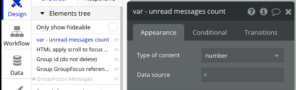
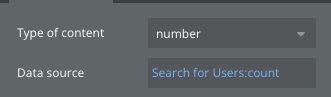
To set up the badge value, open one of the widgets listed above that has the option of a badge. For example, if open the widget_messages element in the Bubble editor, we can see a 'var-unread messages count' element in the elements tree that has a Data source value of 4.

To make this number dynamically represent a number of things for the current user, we want to change the date source value to be a dynamic expression with a search that finds all the things that apply to this user and then get the count.

Specific element details

Notifications

Element name: widget_notifications Purpose: Display notifications to your users

This element contains a simple user interface for displaying unread messages or notifications. To use this UI, please replace all dummy data type with the data type you want to display (e.g., Messages or Notifications).

Add workflows to Button Mark as read, Group Select message, and Group view more.

Search

Element name: widget_search Purpose: Provide a convenient location for your users to search and view results

This focus group reusable element contains a simple user interface for searching for things. To use this UI, please replace all dummy data type with the data type you want to display (e.g., Files or products).

Add workflows to Group Select item and update data source of RepeatingGroup Dummy.

Shopping Cart

Element name: widget_shopping_cart Purpose: Display the items in the user's cart for easy review and checkout

This focus group reusable element contains a simple user interface for reviewing the items in your cart. To use this UI, please replace all dummy data type with the data type you want to display (e.g., Product or Cart items).

Add workflows to Button removeand Button CHECKOUT.

Messages

Element name: widget_messages Purpose: Display a list of unread messages for the user

These widgets are already preconfigured in the Canvas header. You can set these up using an action when adding icons to any header.

See how to do that here.