Design
This section talks about best practices when it comes to designing your application.
It can be difficult to strike a balance between design, functionality, and maintainability in your Bubble app. Here are a few tips on how to do so.
Design guide
Scale your layouts vertically
Making application fully-responsive and working well at every screen width is one of the hardest things to do in Bubble but one that is critical to not making your users upset. A key component to doing that is creating layouts that scale vertically and not horizontally.
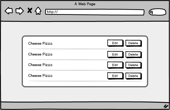
What does that mean? Basically, when creating a layout, think of what will happen when you need to add more stuff to it and when the screen becomes more narrow. Let's say you're creating a layout for a very simple row in a list with 2 action buttons, edit and delete. You may come up with something like this:

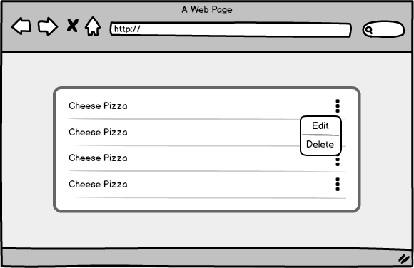
But what happens if the screen gets more narrow? Perhaps you can still fit the name and two buttons on a phone screen but what about when you need to add a third button? A better and more scalable alternative is one where you add buttons vertically, instead of horizontally:

White space is good
There is not much to say here, except for that having white/empty space in your application can be very effective in making the application feel uncluttered and clean.

Style system
You should make sure that every element that you use (or at least almost every element) is using a Style instead of having its visual properties on the element itself. This ensures the following:
That you're forced to keep your elements consistent and thus pleasing to the end user
That, if you ever decide to change the look and feel of your application, you won't have to hunt down individual elements and will instead be able to update multiple at a time
That your application is slightly smaller in size (this probably won't matter for most apps but if you have thousands of elements, the extra code required to store the visual properties on each element can really add up).
At the same time, you should ensure that you don't have too many styles because then they will be difficult to manage and also result in inconsistent UI. Somewhere in the 5-10 range is probably right for most element types (some may require fewer, some more).
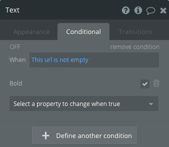
What to do if you need to have an element that's styled in a one-off way? For example, let's imagine that you have an existing text style that you need to make bold in a single place. Do you create a whole separate style for that? We generally don't, instead we use a hack where we conditionally set the font to be bold and make the condition apply all the time. Below is an example.

Size and spacing system
The Style tab doesn't ensure that the sizes of your elements and padding are consistent, so you have to take care of that separately. Here are a few sample conventions that we use in Canvas:
Pages have a width of 1220px
Primary content goes into a group that's 860px wide
Each primary content block is 780px wide
Small buttons are 25px high, big buttons are 40px high
There are 15px of spacing between each input
Etc.
Big design decisions
As you're designing and laying out your application, there are some high-level decisions that you'll need to make.
Lots of pages or lots groups on a single page?
You'll have to decide whether you'll build a separate page for each of your screens or whether you put them on the same page, in hidden groups that show at the right time. Here's a table that compares the two methods on multiple dimensions:
Dimension
Separate page
Group on a page
Speed
Each page will load quickly BUT a lot of page loads will be required, so overall probably a bit slower.
The overall page will load slower but switching between groups will be very quick.
Modularity
Very modular because all you have to do is just link to the page if you need to integrate it into a new flow or expose it to a new user type.
A bit less modular because it's embedded within a larger page. However, that can be remedied by using a reuseable group.
Navigation
Very easy to link to.
Harder to link to an individual group but not that hard as long as parameters are used for navigation.
Where we've landed with Canvas is that we use both separate pages as well as multiple groups on a page, depending on the use case. Let's imagine a very basic social networking application with the following functionality:
Users can search for other users and view their profiles
Users can add other users as friends
Users can message their friends
Users can update their profile and settings
We would probably use the following pages:
Search page - this would be a standalone page where the user will search for other users and view the results in a list.
Profile page - this would be a standalone page that will show information about a particular user.
Dashboard page - this would be a page with several hidden groups that will be used to approve friend requests, message other users, and update profile/settings.
If you decide to have multiple groups on a page, you shouldn't stack them in an overlapping way on top of each other because the page height will then have to be as tall as the tallest group and you might end up with unnecessary empty space at the bottom. Instead, stack them vertically, one below the other one, and set each one to collapse when hidden. Also, you should make them all invisible by default and only visible when they need to be (vs. making all groups visible by default, which will result in a flash of content that is later hidden).
Reusables or not?
Generally, reusable elements are great. They fit well within our principle of modularity and allow us to easily add repeated functionality without needing to duplicate it. There is, however, a relatively large BUT, which is:
It's relatively hard to pass data to and from reusable elements
Each reusable element accepts an object or a simple value and each custom workflow within a reusable also accepts an object or a simple value. The hard part starts when you need to either pass more than 2 parameters to the reusable element or you need to reference the result of something that happens within the reusable element. There are three non-ideal ways to do that:
(Most likely a bad idea) Set fields on the
Current Userto pass data back and forthSet states on the reusable elements and reference them in either direction (either from page to reusable or from reusable to page)
Update the URL parameters and refer to those in either direction
Use one of the global variable plugins
#1 is probably a bad idea because multiple people won't be able to use the same user account at once. And #2-#4 are all doable but require a bit more work than not using reusables.
Now that we've caveated reusable elements, let's reiterate that you should probably be using them, especially if you're building functionality that will need to be accessed in multiple places and doesn't require passing a lot of data back and forth. A great example is a popup for editing an object - it only needs one parameter, which is the object itself and is most likely needed in multiple places (in the dashboard of the user who creates the object, in the dashboard of the app's owner, etc.).