Canvas Documentation
5.1
5.1
  • Introduction
  • Key Features
  • What's New
  • Canvas Design System Figma File
  • CANVAS FUNCTIONALITY
    • Getting Started
    • Branding & Design
    • Marketing Pages
    • Bubble Pages & Blocks
    • Roles & Permissions
    • Menus & Navigation
    • Data & Workflows
    • Emails & Alerts
      • Mail merge terms
    • Miscellaneous
      • Setting up two factor authentication
      • Cookie and consent banner
      • Setting your password policy
      • Set up Payment info on Account page
      • Loading screen
      • Configuring multiple languages
      • Customizing your app's portal page colors
    • Reference
      • Pages
        • Index
        • Home 2
        • Home 3
        • About us
        • Pricing
        • Admin Portal
        • Account
          • Account deletion
        • Login
        • Legal
        • Reset Password
        • 404
      • Reusable elements
        • Header
        • Footer
        • Signup & Log in
        • Cookies Permission
        • Widgets
          • App security
          • Header Widgets
          • Workflow Widgets
        • Admin Portal
          • Admin analytics
          • Admin email & templates
          • Admin header & footer
          • Admin legal popups
          • Admin branding, launch, and settings
          • Admin pages
          • Admin portal canvas logic
          • Admin options settings
        • Menu Focus Elements
      • Data types
      • Option Sets
      • Backend Workflows
      • Design standards
        • Manually Building UI
  • Bubble Best Practices
    • Learning Bubble Basics
    • Principles
    • Database
    • Design
    • Security
    • SEO
    • Speed
    • Modularity
      • Data triggers
    • WU Optimization
  • Canvas library
    • Updating asset RG data source
    • Page templates
      • Basic Bubble Marketing Page
      • Chat Messenger Page
      • Form Builder Page
      • Centered Profile Page
      • Left-Justified Profile Page
      • Standard page
      • Toggle Tabs Page
      • Menu Page
      • Mobile Menu Page
      • Video List Page
      • Horizontal Tabs Portal / Dashboard Page
      • Simple Portal / Dashboard Page with Icons
      • Standard Portal / Dashboard Page
      • Search Page
      • Map Search Page with Toggle and Filters
      • Floating Map Search Page
      • Search Bar Page
      • Multi-Step Page With Progress Bar
      • Standard Multi-Step Process Page
      • Multi-Step Process Page with Sidebar
      • Gallery Profile or Product Page
      • Sidebar Profile Page with Tabs
      • 2-Column Menu Tabs Page
      • 2-Column Checkout Page
      • 2-Column Video Chat Page
      • Vertical Multi-Step Page Template
      • Double Sidebar Portal Page Template
    • Blocks
      • Pagination
      • Monthly Calendar Scheduling Widget
      • No Reply Comments Thread
      • Nested Comments Thread (with Like and Reply)
      • Placeholder Group
      • List with Circular Progress Bar Repeating Group
      • Top Input Chat Widget
      • Bottom Input Chat Widget
      • Toggle Tabs Group
      • Single-Select or Multi-Select Pill Tabs Group
      • Settings group
      • To-Do List Repeating Group
      • Title Group with Button and Filters
      • Product Details Group With Progress Bar
      • Listing details with Icons and Menu Focus Group
      • Week Daily Availability Group
      • Frequently Asked Questions (FAQ) Repeating Group
      • Dismissible Module
      • Video Group
      • About Group
      • Add to Cart Group
      • Full Width Map with Directions Link
      • Location Module (Map and Directions)
      • Drag and Drop Repeating Group
      • Infinite Columns Horizontal Scroll Data Table with Fixed First Column (Repeating Group)
      • Nested Data Table (Repeating Group)
      • Standard Data Table (Repeating Group)
      • Standard Data Table (Table Element)
      • Mobile-Friendly Data Table (Repeating Group)
      • Mobile-Friendly Data Table (Table Element)
      • Infinite Columns Horizontal Scroll Data Table (Repeating Group)
      • Infinite Columns Horizontal Scroll Data Table (Table Element)
      • Activity Feed
      • Page
      • Nested Repeating Group
      • Advanced Form Inputs Group
      • Reviews with Ratings Summary and Images
      • Reviews Repeating Group with User Images
      • Reviews (Text Only) Repeating Group
      • Standard Repeating Group with Image
      • Search Bar Group
      • Listing Details Group
      • Post Group with Upvoting UI
      • Large Chart Dashboard Widget
      • Chart With Key Metrics Dashboard Widget
      • Main Image with Thumbnails
      • Centered Profile Block
      • Left-justified Profile Block
      • Tile Image Gallery and Popup
      • Image Feed with Nested Comments Thread
      • 1-Column Standard Form Inputs Group
      • 2-Column Slideshow Tiles Repeating Group
      • 2-Column Repeating Group (Text, Link, Image, and Description)
      • 2-Column Repeating Group (Link, Text, and Button)
      • 2-Column Repeating Group with Actions
      • 2-Column Grid Tiles Repeating Group
      • 2-Column Form Group
      • Expiration timer
    • Popups
      • Edit Drawer
      • Map Location Details Drawer
      • Details and Comments Drawer
      • Confirmation Popup
      • Message Popup
      • Image Popup
      • Video Popup
      • Vertical Scroll Popup
      • Permissions popup
      • Multimedia Slideshow Popup
      • Edit Popup
      • Standard Form Popup
      • Subscribe Popup
      • Feedback / Contact Popup
      • Details Popup
      • Add List Popup
      • Advanced Form Popup
      • Rating Popup
      • Toggle Tabs Popup
      • Share Popup
      • Multi-Step Popup
      • Invoice Popup
      • Stripe Credit Card Purchase Popup
      • View Profile Popup
      • Send Message Popup
      • Multi-Select Pill Tabs Popup
      • Net Promoter Score (NPS) Popup
      • Pricing Plans Popup
    • Reusables
      • Multimage uploader
Powered by GitBook
On this page
  • Change the base color
  • Adjust the lightness and saturation of the color palette
  • Change the alert color
  • Change the mode of each sidebar
  • Add other types of portal pages to your application
  1. CANVAS FUNCTIONALITY
  2. Miscellaneous

Customizing your app's portal page colors

PreviousConfiguring multiple languagesNextReference

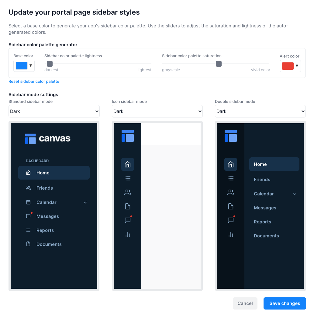
The "Update your portal page sidebar styles" within the "Branding" tab of the admin portal allows you to generate a custom color palette for your app's sidebars based on a single base color. You can also adjust the modes of each sidebar type from "dark" to "light" mode within this popup.

Change the base color

Change the base color used to create your sidebar color palette. This base color is usually your app's primary color.

Adjust the lightness and saturation of the color palette

Use the sliders to adjust the lightness and saturation of the autogenerated colors. If your base color is red, pink, or orange, it is likely that you will want to first increase the lightness and then increase the saturation to make the colors look brighter and more vivid.

Change the alert color

After you change the base color, the alert color will be set to the base color's complementary color. For example, if you select orange as your base color, the alert color will be blue. You can override the alert color with any color.

Change the mode of each sidebar

You can change the mode of each type of portal page using the "mode" dropdowns above each sidebar preview within the popup. Changing a portal page's mode from "Dark" to "Light" and then clicking save will change that type of portal page template's colors to display that style when the page is loaded. For example, if your icon portal page template is set to "Light", and you have an icon sidebar portal page somewhere in your app, that sidebar will be set to "Light" mode colors when viewing that page in preview mode.

You can also programmatically change the mode by adjusting the "var - sidebar mode" within that page template's "Hidden Variables" popup.

Add other types of portal pages to your application

The Canvas Base Template includes the "Standard" portal page design within the app's admin portal. You can add the "Icon" and "Double" sidebar portal page designs using the Canvas extension.