
Miscellaneous
We've included some guidance here to demonstrate how to manage additional features of the Canvas template.
Setting your password policy
Setting your password policy in the admin portal will automatically update the password check UI throughout Canvas.
The Canvas template includes a built-in password check UI during the signup flow and anywhere the user is required to reset their password. By default the password policy is set to require 5 total characters and at least 1 number.
You can manage the requirements for your password policy directly from the Admin portal of your application. From the left menu click on Settings > Password policy.
There are four policies that can be set:
Password minimum length - This sets the total characters that are required for the password to be valid.
Require numbers (optional) - If checked you must set the total numbers required in the input to the right.
Require special characters (optional) - If checked you must set the total special characters required in the input to the right. Characters that qualify as special characters for this rule are "(", ")", "!", "@", "#", "$", "%", "^", "&", and "*".
Require uppercase letters (optional) - If checked you must set the total special characters required in the input to the right.

This is a Canvas feature and it does not utilize Bubble's built-in password policy feature. To use this in conjunction with Bubble's built-in password policy, in the Bubble editor go to Settings > General and set your password policy there as well. If you do update your Bubble password policy, please ensure that your Canvas password policy matches your Bubble password requirements. This will ensure the password policy check UI in throughout your app is up to date.
Cookie Permissions & Consent Banner
We consider it a best practice to ask users for consent to save cookies before storing data on their device and have built this functionality directly into Canvas. To set this up properly, let's start in the Bubble editor.
Enabling Cookie Permissions
Once you have the editor open, from the left menu navigate to Settings > General > Privacy & Security. Here we need to check the box that says 'Do not set cookies on new visitors by default'

Next log in to the admin portal, click on Settings > Cookies and toggle the 'Require users to agree to the storing of cookies in their browsers when they visit your website' to ON.
Cookie Consent Banner
Element name: cookies_permission Purpose: Get the user's consent to store cookies on their device
The Cookie Consent Banner is built as a reusable floating group and by default is placed on the index page of your Canvas template and anchored to the bottom.
To add the consent banner to another page, drag it from the list of Reusable elements onto the design canvas of the page you would like to place it and make sure it is positioned at the bottom edge of the page.

Set up Payment info on Account page
Canvas comes with built in UI on the Account page for displaying the saved credit card details for your users as well as a history of transactions they have initiated.
Before setting up payments, from your Bubble editor navigate to Plugins > Add Plugins and search for Stripe. Install the plugin that was made by Bubble.
The Bubble stripe plugin adds additional fields to your user data type that can now be accessed.
In the credit card display we use a group called 'Group credit card brand name' to manage many of the conditions for this view.

Payment Workflows/Logic
After you have connected the existing UI, you will still need to set up the logic for the payment process. This includes:
Saving payment information (credit/debit cards)
Running the appropriate workflows from Stripe (or your payment provider)
Recording any other relevant information in your app
Responses from the workflows in step 2
Last 4 digits of card (for identification)
You will need to set most of this up on your own.
One option that is available through Canvas is a Purchase Popup that contains the necessary UI and workflows to save or delete users' credit card info via Stripe. The visual part of this popup can be used for other payment providers, but the workflows are specific to Stripe.
Loading screen
The loading screen element allows you to display a loading animation while your page's elements and data are being loaded beneath. You will want to include this on every page where you want this behavior.
The element can be found under Visual elements.

Simply drag it on to the page in order for it to be active. No matter how large the element is, it will always take up the full width of the page. Make it 1x1 pixels and place it in the top right corner of the page to avoid responsiveness issues.

The properties panel provides several options for customizing the behavior and appearance of the loader.
There are two ways in which you can use the loading element.
1. Display by default on page load
If the element is set to be visible on page load, a loading screen will appear on the page until you explicitly hide it. In order to have it disappear once the page's elements are loaded, you can either:
Create a workflow which is triggered when the page is loaded & loaded above the fold. Attach the Hide loading screen action.
Check the loading screen element's Auto close option


2. Manually set when to show/hide the loader
Under Workflow actions > Plugins, you have two loader actions, one to show the loader and one to hide it. Use these to show the loader while specific workflows are firing (i.e. while making bulk changes to a list).

Customizing the loader style

Updating the animation You can change the loader animation by pasting in a new animation json URL from lottiefiles.com (requires signup). Adjust the width and height in the code below to modify the size of the animation.

Updating the loading screen text Modify the code in the loading screen element's text field to tweak the font size, color, weight, line height, and description.

Configuring multiple languages
Canvas is designed to support multiple languages and integrates the language selection directly with Bubble. In addition, we provide an easy integration with LocalizeJS for full language support throughout your app.
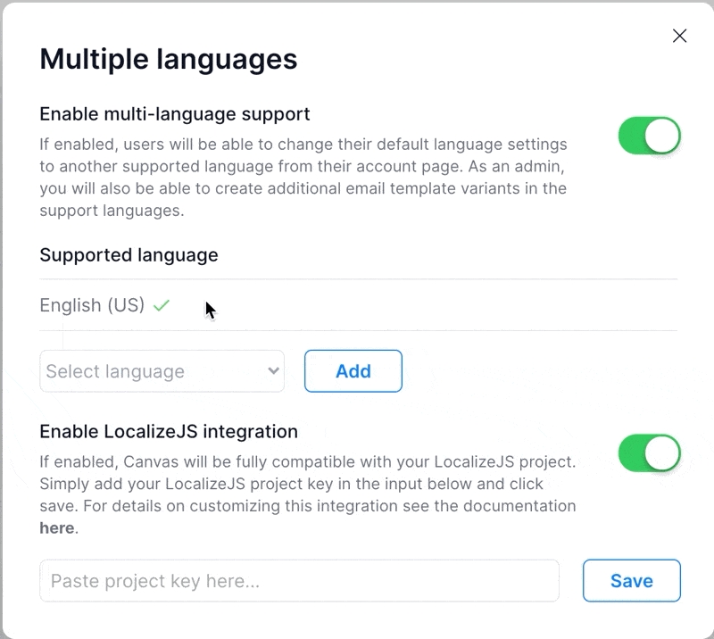
Enabling multiple languages
By default your Canvas template will have multi-language functionality turned off. If you would like to use additional languages, in the admin portal navigate to Settings > Multiple Languages and toggle the 'Enable multi-language support' option.
With multi-language support enabled you will see additional functionality available to you.
Supported Languages
This is a list of languages that you can allow your app to support will contain English (US) as the default for your platform.
You can add additional supported languages by selecting from the dropdown and clicking the add button. When you have more than one supported language, from the action menu you can choose to set a new language as the default.Add a captionThe default language cannot not be removed from the system and is used throughout Canvas as the fallback language if the user has not set a default language for themselves.
LocalizeJS Integration
If you haven't already, create an account and a new project on https://localizejs.com.
Setting up the details of your project within Localize is outside the scope of this tutorial but LocalizeJS has created detailed walkthrough documentation here.
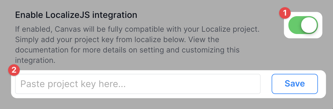
Enable Localize
In the admin portal, navigate to Settings > Multiple Languages. Multi-language support should already be enabled from the previous step.
Find the 'Enable LocalizeJS integration' option and toggle it to on.
Once you have enabled your integration, copy the Project Key from your LocalizeJS dashboard. Paste this into the project key input and click the save button.
Customize your Localize integration
The default integration in Canvas handles generating the code including your dynamic project key and the default language set for the app. Below is the code that we use to initialize this integration.
If you would like more granular control over your integration we recommend you simply toggle off the built in Canvas functionality and add your own custom localizeJS script directly to the Script/meta tags in header field found in the Bubble editor under Settings > SEO/metatags.
Last updated
Was this helpful?