Menus & Navigation
The Canvas template has three main navigation reusable elements: the Header, the Footer, and the Menu Focus Group.
The Header
Element name: header Overview: The Canvas header allows Canvas developers to create any number of headers for an app. The header reusable dynamically displays different navigation elements, including texts, icons, buttons, the Current User profile image and group focus, and mobile menu.
This header element is fully responsive, and it is used on every page of the Canvas template. Each Canvas application comes preconfigured with three headers as shown below.
Admin user

Standard logged in user

Logged out user

Creating/editing a header
Canvas developers can create any number of Headers within the admin portal, and each Header can have any combination of dynamic navigation elements (icons, texts, buttons, and the Current User profile picture).
You can create a new header or you can choose to clone an existing header if you have one that is similar to what you would like to create.

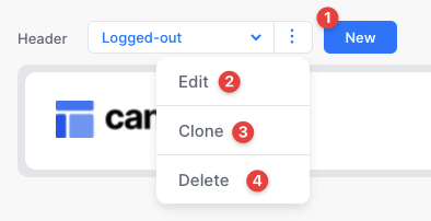
Click New to create a new header from scratch
Click Edit to edit the name of the currently selected header
Click Clone to duplicate an existing headers settings into a new header
Click Delete to remove the currently selected header
Telling Canvas which header to display
Canvas will display any Header based on the “var - current header” hidden variable within the header reusable. As you create new Headers, you will need to add more conditionals to this hidden variable to specify when to show each Header. For example, you could show a specific Header based on the Current User’s role or show a particular Header based on a certain page’s name.
Remember, when setting conditionals Bubble will give priority to the last condition that is true. So if you have three conditions and both condition #1 and condition #3 evaluate as true, Bubble will prioritize condition #3 over condition #1.
Header sections
Each header can contain custom text links, icons, or buttons and have multiple actions that can be set for each item. Learn about how to use each action here.
Text
Text Navigation items will appear to the left of the icons in your header. On a mobile screen, these elements will be moved from the header into the mobile dropdown menu.
Icons
The icon element is a special element as we have included four reusable Bubble elements with GroupFocus drop downs that you can set up to be triggered from the icon.
You can add up to 4 icons per header but for best mobile experience we recommend using a max of 3 icons for a header that has the logged in state toggled on
To set up this functionality, in the Edit Icon Option popup select the Open widget action type and then select from one of the four widgets below.
Widget Notifications This action will show a notifications group focus when clicked. Learn how to customize this element here.
Widget Action Trigger =
Open notifications widgetRecommended icon =
bell
Widget Messages This action will show a messages group focus when clicked. Learn how to customize this element here.
Widget Action Trigger =
Open messages widgetRecommended icon =
messages-circle
Widget Search This action will show a search input within a group focus when clicked. Learn how to customize this element here.
Widget Action Trigger =
Open search widgetRecommended icon =
search
Widget Shopping Cart This action will show the shopping cart group focus when clicked. Learn how to customize this element here.
Widget Action Trigger =
Open cart widgetRecommended icon =
cart
Each of the above widgets contains a small text element that displays a number alert for that widget (think unread notifications or count of items in cart). This number is static by default but can be made dynamic by modifying the var - unread or var - count elements within the corresponding widget reusable.
Buttons
You can include up to two buttons on each header.
General Settings
Logo link Set the logo link for each header. Choose between the index page or another url.
User info Set toggle on if this header is visible to logged-in Users. This header will display the Current User's profile picture with a dropdown menu that allows them to view their account settings or log out.
Check 'Show user's first name' to display the user's name to the left of their profile image.
Note, if you would like to display text other than the user's first name, you can edit the var - user text element within the header reusable.
Mobile menu and responsiveness
Each Header's responsive settings are set automatically. On desktop, the Header will display text links, icons, buttons, and the Current User profile picture. On mobile, the Header will hide any text and button elements, and display the hamburger menu icon. Clicking on the hamburger menu icon will open a mobile menu that contains the Header's text and button navigation elements. The breakpoint to display the mobile menu is determined dynamically for each Header on page load. If a Header does not contain any text or button navigation elements, the hamburger menu will not become visible on mobile.
Updating the logged in focus group menu
You can manually update the elements in the user account dropdown directly from the header reusable element in the Bubble editor.
From the elements tree open GroupFocus Mini > Group Logged In
There is a button for the user to log out, visit their account page, and navigate to the admin portal. We have also included three placeholder buttons for you to customize and add actions if you would like to create additional functionality.
Placeholder button refers to a fully designed button element that has been hidden by default but can be unhidden and used as needed in your application.
The Footer
Element name: footer Overview: Similar to the Canvas Header, the app’s footer reusable element also displays Navigation Items defined in the admin portal. The primary difference between the header and footer is that there is only one footer version; you cannot define different footer variants through the admin portal.
The footer element is included by default on all Bubble marketing pages. For non-marketing pages you will need to add it manually.
How to add, edit, or delete Navigation items
Adding, editing, and deleting Navigation Items within the Footer is the same as doing so in the Header.
Styling
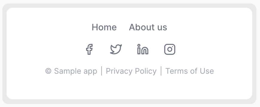
The Footer’s desktop design has the app’s text links aligned to the left and the app’s social media icons aligned to the right:

On mobile, all elements become centered:

Footer Sections
Pages
Pages are simple text links and your template will have two Navigation items in this section linking to the Home and About pages.
Legal
Canvas allows you to manage your terms of service and privacy policy content directly from the admin portal. By default the footer will have a link to both the Terms of service and Privacy policy pages.
We have provided default content for your but the content contains references to text that needs to be changed. If you search for all references of the word "Sample" and replace those with an appropriate word (usually the legal name of your company), that is a start, but you should also determine if the content of the documents is appropriate for your application.
To edit the content for these pages, from the left menu navigate to Settings > Terms of service or Settings > Privacy policy
We have compiled a list of resources to help you get started with customizing your legal pages.
Privacy Policy resources Terms of Service resources
Social media
Here you can add social media icons to your footer that link to your social media pages.
Setting up Navigation item actions
When adding items to the header or footer, you will see the same actions available to setup for both. You can set up almost any configuration possible. Here's how:
Open Bubble page
Opening a Bubble page will use the Bubble Pages reusable data that is setup inside the editor.
Open external link
Enter a url (including https:) that would like to navigate to when this element is clicked.
Run Bubble action
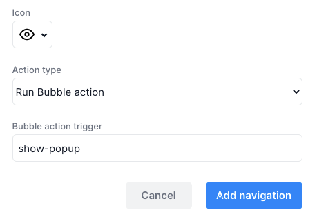
This will trigger a workflow in the header reusable called Run Bubble Action Triggered which is a Javascript to Bubble element action from the Toolbox plugin. The text value that you save in the 'Bubble action trigger' input will be passed through this event as "This JavascripttoBubble's value".
Let's say we want to show a popup when a link is clicked we would set that up with the following steps
First let's decide on a unique text we can use to identify that this particular link was clicked. For this case it would make sense to make that text be
show-popup.Now we need to add an action in the
Run Bubble Action Triggeredworkflow to show the popup. On this action add a condition so that it only runs whenThis JavascripttoBubble's value is show-popup.Finally, to set up the link to trigger this action, we will select
Run Bubble actionas the action type and in the Bubble action trigger will add the textshow-popup.

That's it! The popup will now be shown when the user clicks this link.
We recommend setting up only one action per link trigger in this Run Bubble Action Triggered. If you need to create a more complex action, put those actions in a Custom event and trigger the custom event from the Run Bubble Action Triggered workflow.
Dropdown menu
Element name: menufocus_template Purpose: Provide the user with a concise list of actions they can take in a convenient dropdown menu.
The dropdown menu is used consistently throughout the Canvas template to provide the user with actions they can take such as Edit/delete a thing, View more details, Send a message, etc.
The dropdown is triggered by clicking on the icon, can be dismissed by clicking anywhere outside the dropdown, and is most often used in repeating groups to provide action items for each thing in the list.
Clone the reusable template
Open the menufocus_template and from the top bar of the Bubble editor click Edit > Clone this Page.
Assign the type of content
With your cloned menufocus_template open, double-click in the gray area of the editor to open up the settings for the reusable. Change the 'Type of content' to the datatype you will be using this menu to edit. You will need to change the type of content for the GroupFocus Dummy as well.
Set up the dropdown buttons
In the elements tree click the '+' to open the GroupFocus Dummy. This group contains all the dropdown buttons in the menu. Group Option 2 and Group Option 3 are already set up as the Edit and Delete actions.
There are three more Group Options (1, 4, & 5) that are unused and can be customized to add more buttons to your menu. Each of these groups has a corresponding event in the workflow tab that will be run when the group is clicked.
The menufocus_template reusable element also contains two popups that correlate to the Edit and Delete actions:
Popup Edit Clicking on Option 2 (Edit) in the dropdown will open a standard edit form popup to create or edit a thing.
Popup Remove Clicking on Option 3 (Delete) in the dropdown will open a popup to remove a thing.
Customize/duplicate these popups to your purposes.
Using the custom events
Each popups can be triggered by the corresponding custom events 'Create/edit thing' and 'Remove thing'.

Setting up custom events within a reusable gives you the option of using that workflow from the page it is on with the 'Trigger a custom event from a reusable element' action.
For example, you can add the menufocus_template element to the hidden variables popup on a page and trigger a custom event to create/edit or remove a thing.
Last updated