# Double Sidebar Portal Page Template
## Overview
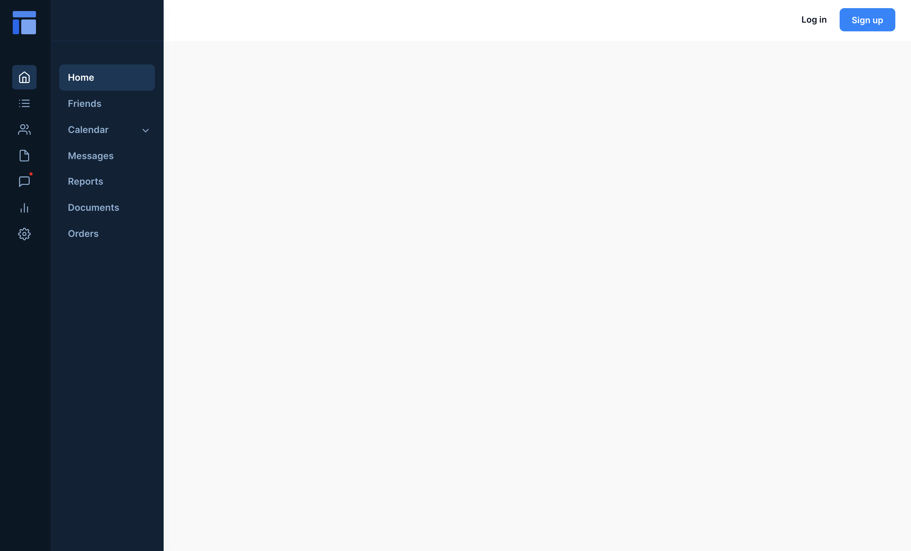
**Desktop**

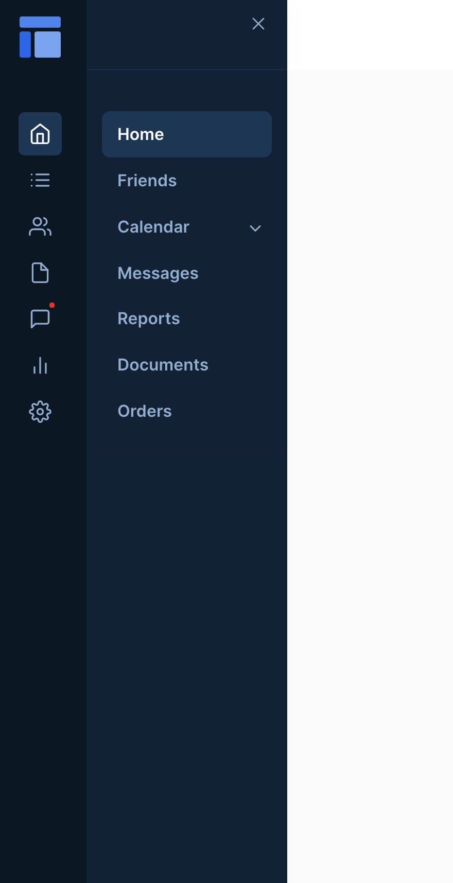
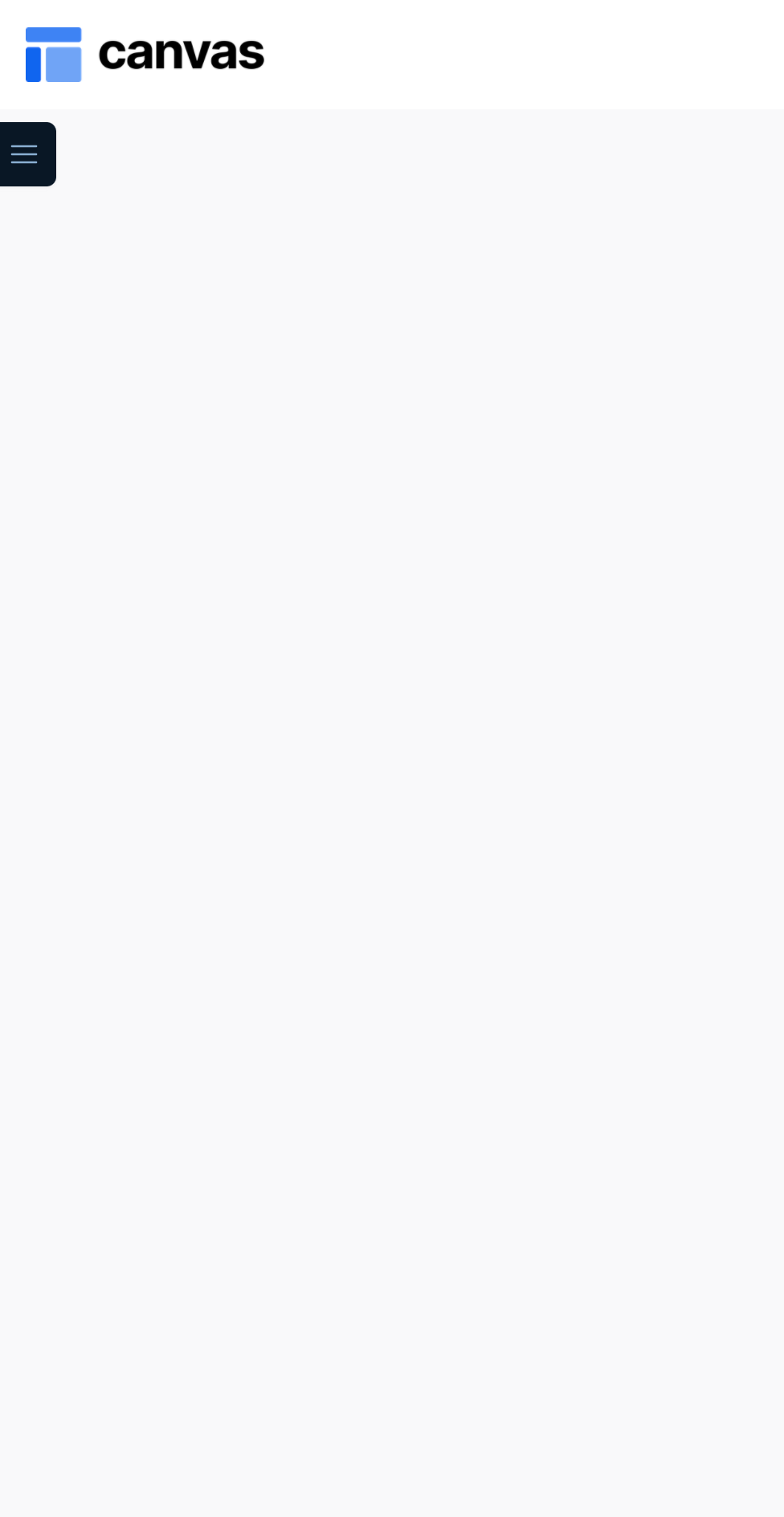
**Mobile**


Responsive layout for a double sidebar dashboard / portal page. Includes a slidable sidebar menu and tab-like UI component for showing and hiding modules. The sidebar menu is hidden by default on mobile but users can click on the hamburger menu in the upper left to open the sidebar.
## Structure
* When this page is added to your app, it will come with two main groups:
* **Blocks container 860 (do not rename)**\
This group contains the responsive settings for all additional modules you would add to the page. It is only visible when the toggle is set to the list view
* **Floatinggroup Sidebar\_website (icons)**\
This group contains all the portal section menu items.
* **Floatinggroup Sidebar\_website (text links)**\
This group contains all the portal tab menu items.
* This page will also come with one popup:
* **Popup Hidden Variables**\
This popup includes various variables that are referenced in workflows or conditionals on the page.
* **var - Website object** - This group stores the `website object` (e.g., app name, primary color, and etc.)
* **var - section url parameter** - This group stores the name of the icon section (of type text) that the user is currently viewing.
* **var - tab url parameter** - This group stores the name of the tab (of type `text`) that the user is currently viewing.
* **var - sub tab url parameter** - This group stores the name of the subtab (of type text) that the user is currently viewing (if applicable).
* **var - dummy** - This is a placeholder variable group. You can store any data here by updating the data type and data source of the group.
* **var - sidebar mode** - This is a variable that controls the mode of the sidebar. You can modify its default value (to "Dark", "Light" or "Dark and light") within the portal page sidebar editor of the admin portal's "Branding" tab.
* For more information on how to use hidden variables, click [here](https://docs.airdev.co/canvas/canvas-functionality/data-and-workflows#using-the-hidden-variables-popup).
* The page comes with two navigation elements that toggle the filter sidebar's visibility on mobile:
* **FloatingGroup Open sidebar button**
* **Group Inner close sidebar**
## How to set up
* Within **the Floatinggroup Sidebar\_website (icons) and Floatinggroup Sidebar\_website (text links)** elements, you will find various groups called **Group Main Nav 1\_text**, **Group Main Nav 2\_text**, **Group Main Nav 3\_text**, and etc. To customize these tabs, simply update the text data source of these groups to the names of your tabs. Feel free to hide or unhide any of these groups depending on how many tabs you need in your portal.
* Each **Group Main Nav #\_text** comes with an alert group for notifications (**Group Nav 3 alert**) which is hidden by default. To enable, simply select the element and check the box for *This element is visible on page load*.
{% hint style="info" %}
If you add more **Group Main Nav #\_text** tabs then please resize **Group sidebar PLACEHOLDER** so that it is not overlapping with any other elements. If any elements are overlapping, responsiveness on the page would not work well.
{% endhint %}
* If needed, resize **Blocks container 860 (do not rename)** and add other modules inside it.
{% hint style="info" %}
If you add more modules, please resize **Group PLACEHOLDER** so that it is not overlapping with any other elements (for responsiveness).
{% endhint %}
### **Showing or hiding a module**
* For each module that you add to **Blocks container 860 (do not rename)**, uncheck the box for *This element is visible on page load* and check the box for *Collapse this element's height when hidden*.
* For each module, go to the Conditional tab and add a conditional statement for when to show the module:
* *var - tab url parameter's text is **Group Inner nav # icon\_text*** *tab's text then This group is visible*
* For each tab within **Group Inner sidebar tabs**, add a workflow that triggers the custom workflow *Navigate* and pass **Group Main Nav #\_text tab's** text (this group's text) as a workflow thing.
### Why is my sidebar not showing?
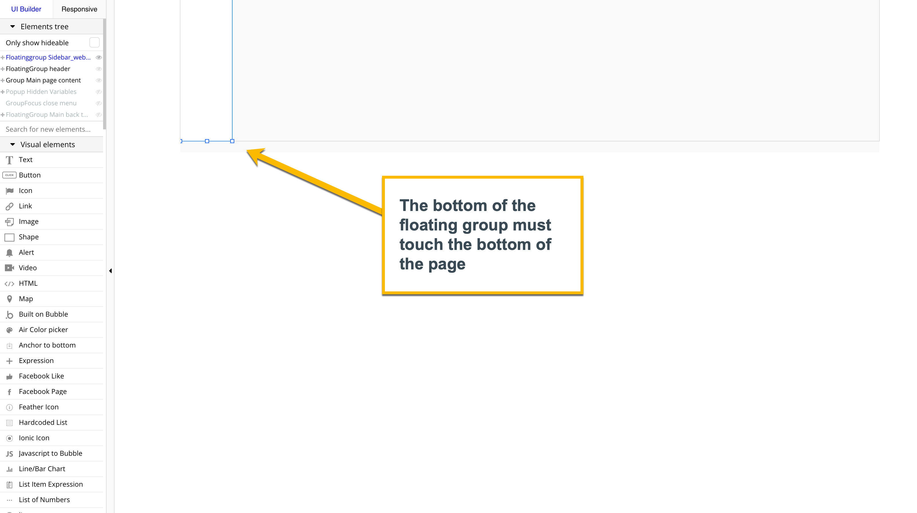
* **Floatinggroup Sidebar\_website** is set to float to both so that the sidebar is anchored to both the top and bottom of the page and allows for scrolling within the floating group. When a floating group is set to both, the floating group height needs to be the same height as the page height (i.e., the bottom of the floating group is aligned with the bottom of the page). If not, then the floating group will "disappear" when you preview the page.

### How do I change the color of the sidebar?
* You can change the color of the sidebar by logging in as an App Admin, going to the Admin Portal > Branding tab > Portal page style