# Header
**Element name:** header\
**Overview:** The Canvas HTML Header allows Canvas developers to create any number of headers for an app. The header reusable element contains a single HTML element that uses custom HTML, CSS, and flexbox to dynamically display different navigation elements, including texts, icons, buttons, the Current User profile image and group focus, and mobile menu.
This header element is fully responsive, and it is used on every page of the Canvas template. Each Canvas application comes preconfigured with three headers as shown below.
#### Admin user

#### Standard logged in user

#### Logged out user

### Creating/editing a header
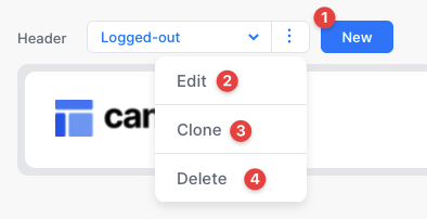
Canvas developers can create any number of Headers within the admin portal, and each Header can have any combination of dynamic navigation elements (icons, texts, buttons, and the Current User profile picture):

You can create a new header or you can choose to clone an existing header if you have one that is similar to what you would like to create.

* **Widget Messages**\
This action will show a messages group focus when clicked. Learn how to customize this element [here](https://docs.airdev.co/canvas/5.3/canvas-functionality/reference/widgets/ui-widgets#messages).
* Icon = `messages-circle`
* Bubble Action Trigger = `messages-groupfocus`
* **Widget Search**\
This action will show a search input within a group focus when clicked. Learn how to customize this element [here](https://docs.airdev.co/canvas/5.3/canvas-functionality/reference/widgets/ui-widgets#search).
* Icon = `search`
* Bubble Action Trigger = `search-groupfocus`
* **Widget Shopping Cart**\
This action will show the shopping cart group focus when clicked. Learn how to customize this element [here](https://docs.airdev.co/canvas/5.3/canvas-functionality/reference/widgets/ui-widgets#shopping-cart).
* Icon = `cart`
* Bubble Action Trigger = `cart-groupfocus`
{% hint style="info" %}
Each of the above widgets contains a small text element that displays a number alert for that widget (think unread notifications or count of items in cart). This number is static by default but can be made dynamic by modifying the `var - unread` or `var - count` elements within the corresponding widget reusable.
{% endhint %}
#### Buttons
You can include up to two buttons on each header.
#### Logged-in state
Set toggle on if this header is visible to logged-in Users. This header will display the Current User's profile picture with a dropdown menu that allows them to view their account settings or log out.
#### Mobile menu and responsiveness
Each Header's responsive settings are set automatically. On desktop, the Header will display text links, icons, buttons, and the Current User profile picture. On mobile, the Header will hide any text and button elements, and display the hamburger menu icon. Clicking on the hamburger menu icon will open a mobile menu that contains the Header's text and button navigation elements. The breakpoint to display the mobile menu is determined dynamically for each Header on page load. If a Header does not contain any text or button navigation elements, the hamburger menu will not become visible on mobile.
### Updating the logged in focus group menu
You can manually update the elements in the user account dropdown directly from the header reusable element in the Bubble editor.
From the elements tree open **GroupFocus Mini > Group Logged In**
There is a button for the user to log out, visit their account page, and navigate to the admin portal. We have also included three placeholder buttons for you to customize and add actions if you would like to create additional functionality.
{% hint style="info" %}
**Placeholder button** refers to a fully designed button element that has been hidden by default but can be unhidden and used as needed in your application.
{% endhint %}
## Header states
The header reusable uses four states (states are often used in reusable elements to pass data between the reusable element and the page):

* **Dark? yes / no state** - If Dark=yes, then the default logo, favicon, button, and link color in the header will be white. If `Dark` = `no`, then the default logo, favicon, button, and link color in the header will be the app's default color. Please see an example of this below on the index page:
{% embed url="" %}
* If you would like to change the background color when the header's "dark" state is "yes" so that it is not transparent, please modify this conditional on the `Group Header` element:

* **Portal page? yes / no state** - When you add a [portal page](https://canvas.airdev.co/resource/portal-dashboard-page-1541199301879x207238372182473540) to your app via Canvas Pages, there will be a workflow on that page for `When page is loaded`*,* `set header's portal page? to "yes".` This will hide the favicon (`Group Logo Mobile`) and show the portal menu group (`Group portal menu`) in the header on mobile.

* **Show portal menu? yes / no state** - On mobile (when on a portal type page), you can click on the portal menu in the upper left corner to open the sidebar menu. This is achieved by setting the state of `Show portal menu` to `yes`.
* **Search page? yes / no state** - When you add a [portal search page](https://canvas.airdev.co/resource/search-page-1541199371286x774569242727011500) to your app via Canvas Pages, there will be a workflow on that page for `When page is loaded, set header's search page?` *to* `yes`*.* This will hide the favicon (`Group Logo Mobile`), show the portal menu group (`Group portal menu`), and change the hamburger menu icon to a search icon in the header on mobile.
## Key Workflows
The header will come will various custom workflows that you can trigger from the page. You can do so by going to the workflow tab in the Bubble Editor and selecting Custom workflow > Trigger a custom workflow from a reusable element > Select header from the dropdown and the custom workflow name

