Single-Select or Multi-Select Pill Tabs Group
Use this to add single-select or multi-select pills above any repeating group.
Overview
This block includes the Multiselect Pills visual element from the Canvas UI elements plugin.
Structure
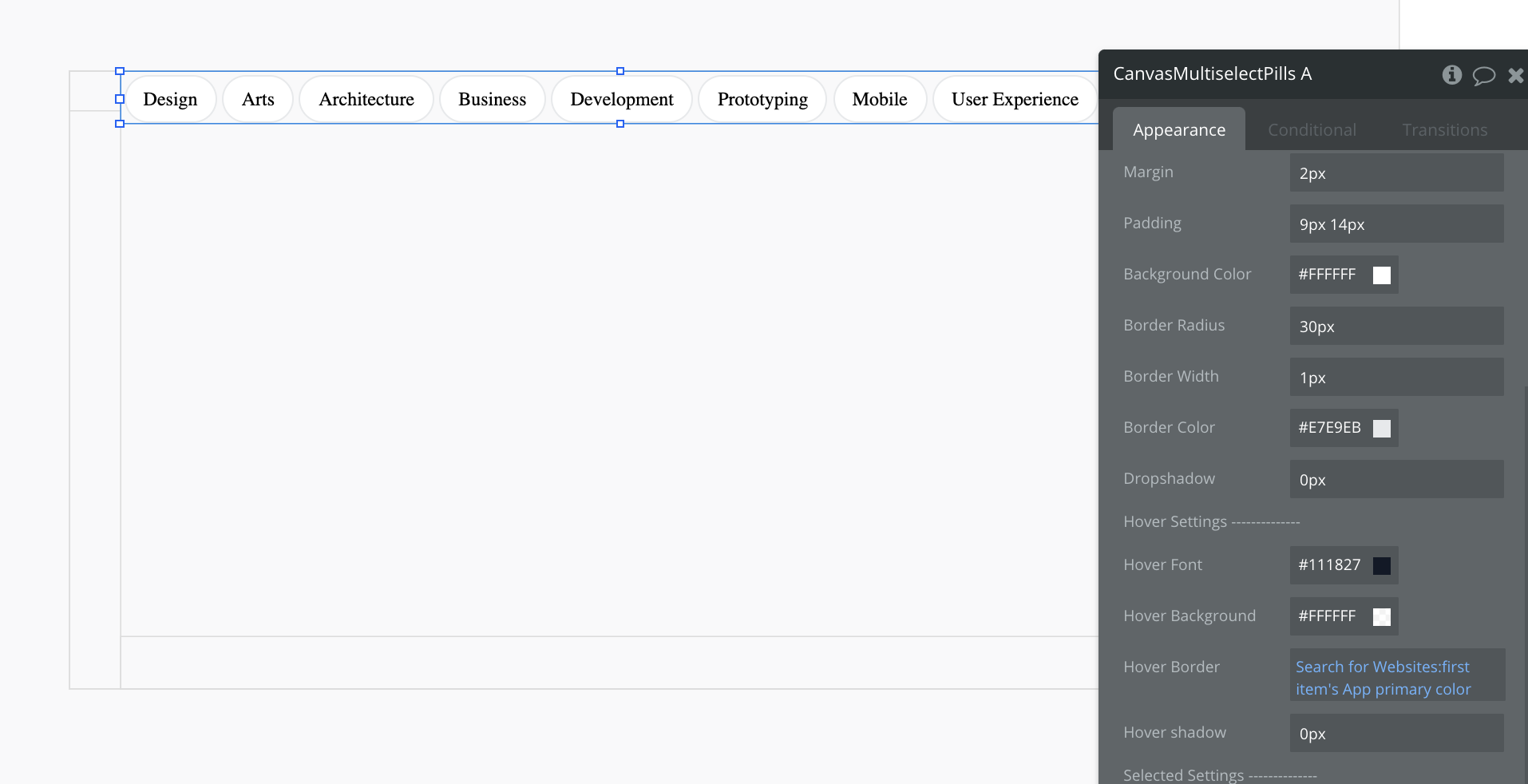
The CanvasMultiselectPills plugin element can display any list of Things in pill-shaped tabs. The pills are responsive in width and will adjust based on the display text of each pill.
By default, the pill style will utilize your app's primary colors. You can adjust the styling within the property editor of the visual element.
How to set up multi-select tabs
In the CanvasMultiselectPills plugin element's property editor, update the type of content and data source of the plugin element.
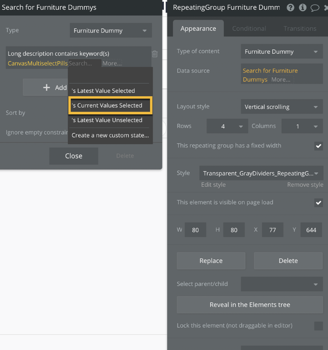
If you are using this element to filter a repeating group, add a constraint to your repeating group, which utilizes the "Current selected" state of the plugin:
You do not need to add any workflows for the multi-select functionality. The plugin element has multi-select functionality built into it.
How to set up single-select tabs
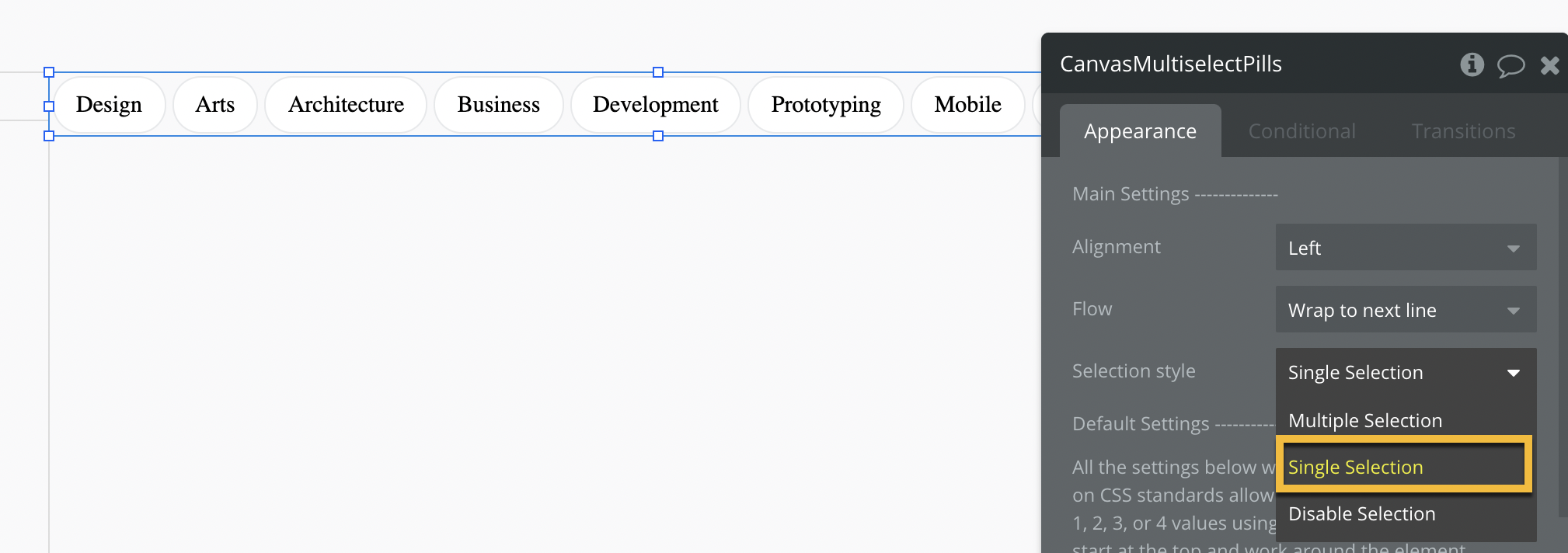
In the CanvasMultiselectPills plugin element's property editor, change the selection style from "Multiple Selection" to "Single Selection".
In the CanvasMultiselectPills plugin element's property editor, update the type of content and data source of the plugin element.
If you are using this element to filter a repeating group, add a constraint to your repeating group, which utilizes the "Current selected" state of the plugin:
You do not need to add any workflows for the single-select functionality. The plugin element has single-select functionality built into it.
Other customization options
Change the alignment of the tabs from "left-justified" to "centered" or "right-justified" through the property editor's alignment dropdown.
Change the responsive behavior of the tabs from "wrap to the next line" to "scroll horizontally" or "scroll vertically" through the property editor's flow dropdown.