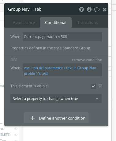
2-Column Menu Tabs Page
Use this for editable onboarding and complex form pages.
Overview
Responsive layout for a two-column page with multiple tabs. This page is ideal for an account or settings page.
Structure
When this page is added to your app, it will come with four main groups:
Group Main This group contains the responsive settings for all blocks.
Group Tabs main This group contains all the tabs content groups.
Blocks container 860 (do not rename)
This group contains the responsive settings for all blocks on the page. You should add any new blocks to this group.
Group Side Portal Content This group contains all the menu navigation tabs. There are ten placeholder tabs that you can hide or show.
This page comes with one popup:
Popup Hidden Variables contains two groups:
var - Website object This group stores the website object (e.g., app name, primary color, and etc.)
var - dummy data A placeholder group in case you want to use any hidden variable groups later.
var - tab url parameter - This group stores the tab name of which tab the current user is viewing
var - show sidebar? - This group includes conditional statements on whether or not to show/hide Group Side Portal. The sidebar will be hidden when the current page width is less than or equal to 824.
var - show tabs content groups? - This group includes conditional statements on whether or not to show/hide Group Tabs main. The tabs content group will be hidden when the current page width is less than or equal to 824.
This block will come with one reusable element:
How to set up
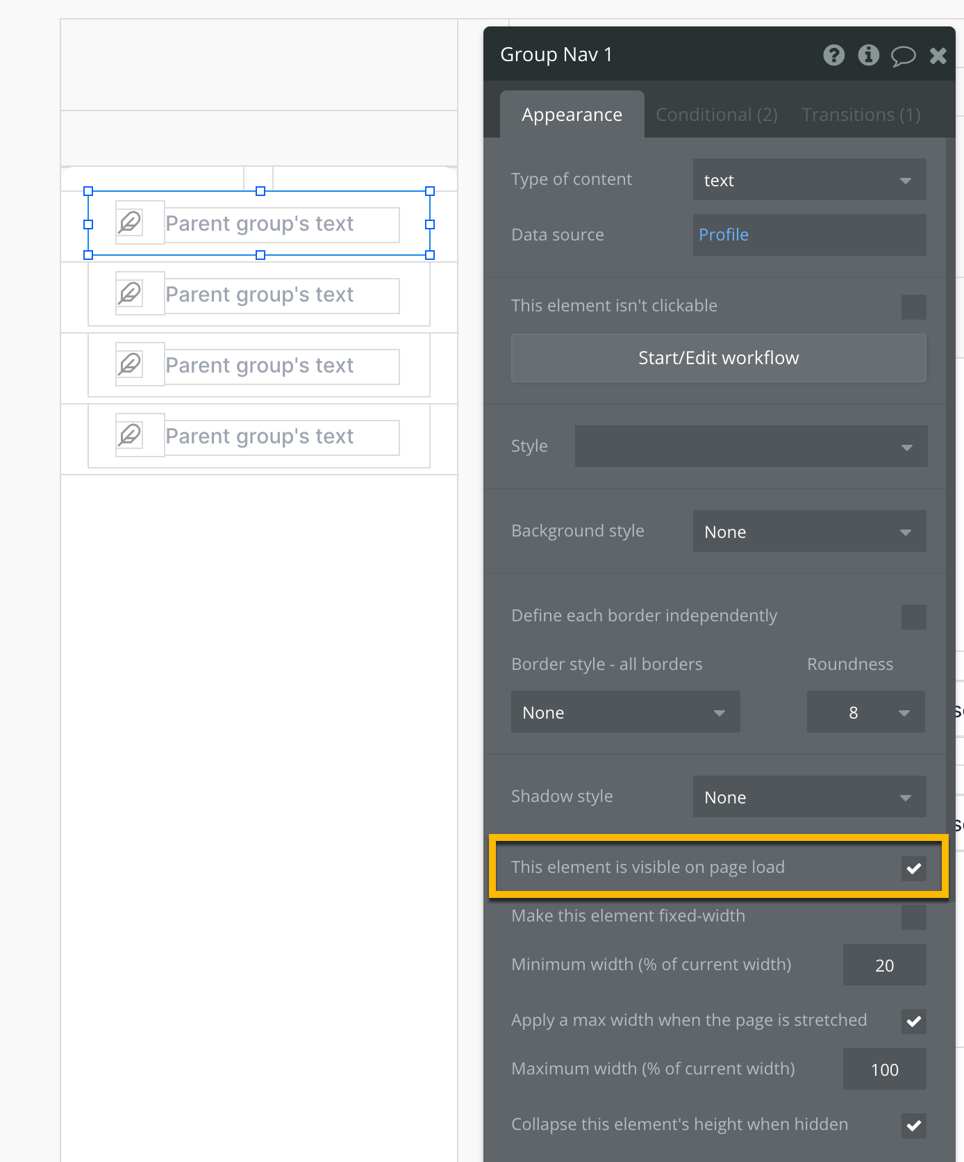
Show or hide any navigational menu tabs (e.g., Group Nav Tab 2 -) in the sidebar. To show a menu tab, check the box for This element is visible on page load.
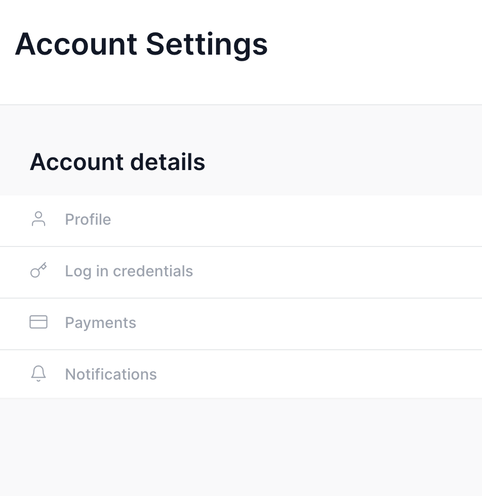
Within Group Side Portal Content, you will find various groups called Group Nav Tab 1 - Profile Container, Group Nav Tab 2 - Login Credentials Container, Group Nav Tab 3 - Payments Container, Group Nav Tab 4 - Notifications Container, and other placeholder containers that are hidden by default.
How to hide tabs
To hide tabs, please uncheck "this element is visible on page load" on the Group Nav Tab [number] - [Label] Container elements that you would like to hide.
How to edit the label of tabs
To edit the label of tabs, click on the "Group Nav 1", "Group Nav 2", "Group Nav 3" and "Group Nav 4" elements, adjust their text data source to be the new label.
If you add more blocks to Blocks container 860 (do not rename), you will need to resize Group Main PLACEHOLDER so that it is not overlapping with any other elements (for responsiveness)
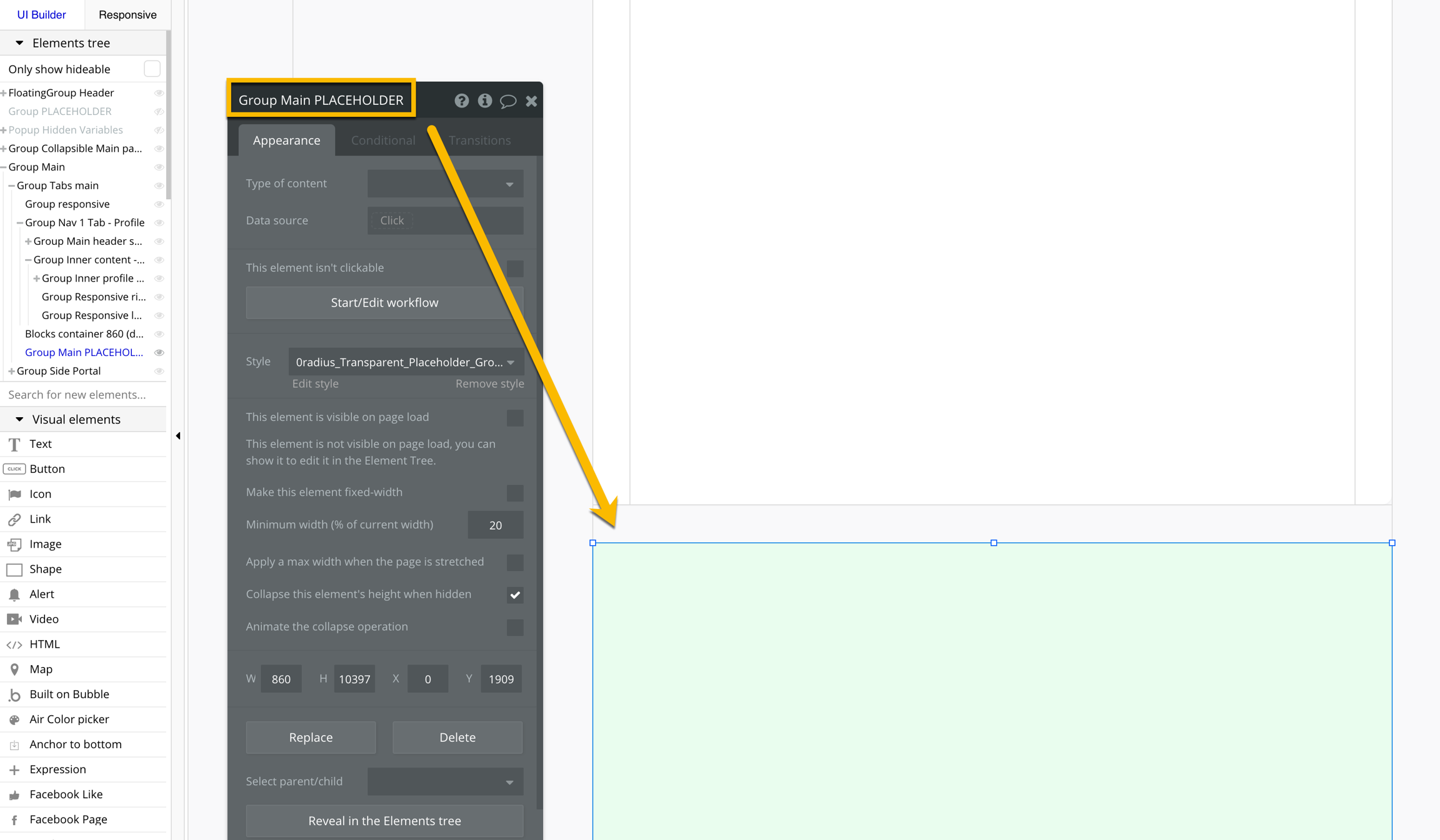
Placeholder groups are commonly used on pages to preserve vertical space that may be needed in the future. It is important to re-size them and check to make sure that they are not overlapping with other elements in order to prevent responsive issues.
When adding new blocks, you will need to replicate the header responsive settings and workflows from Group Nav 1 Tab - Profile. To do this, copy the conditional statements and workflow from Text profile to your new block's title element:
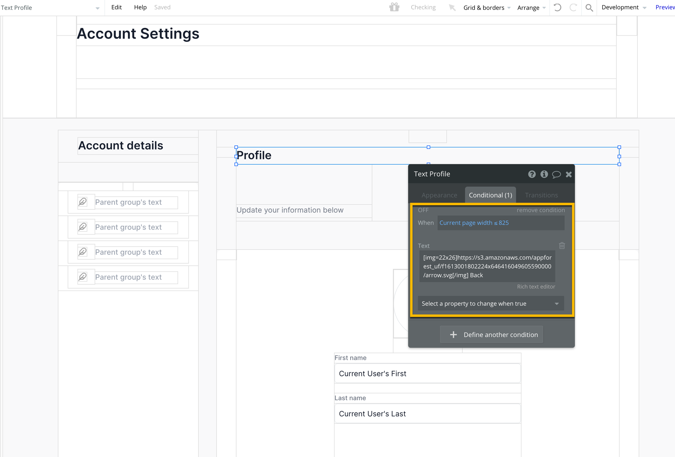
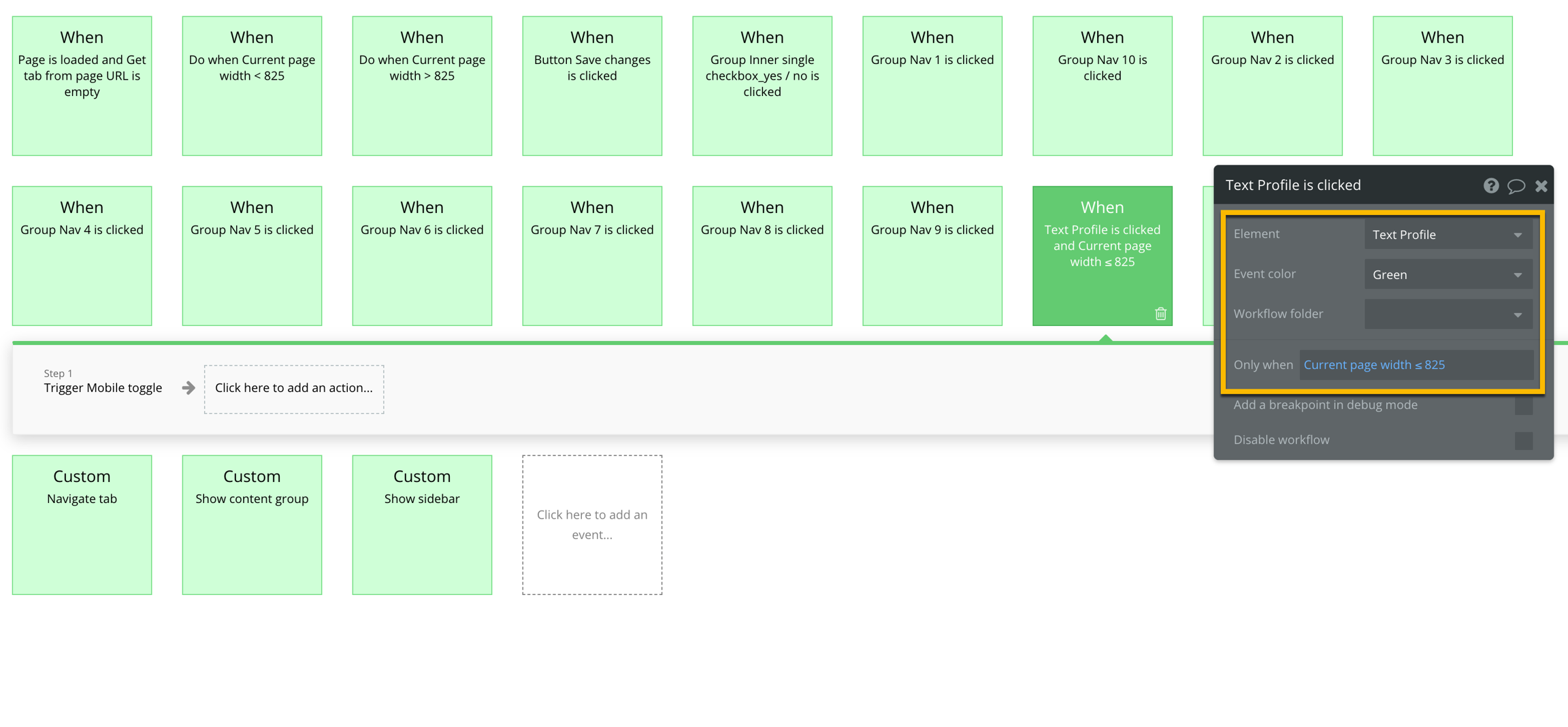
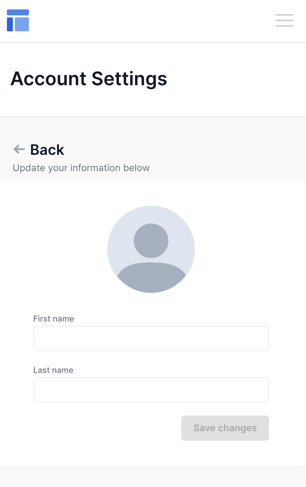
Doing the above will ensure that users can click on the block title on mobile to go back to the sidebar menu.
Showing or hiding a block
For each block in Blocks container 860 (do not rename), uncheck the box for This element is visible on page load and check the box for Collapse this element's height when hidden
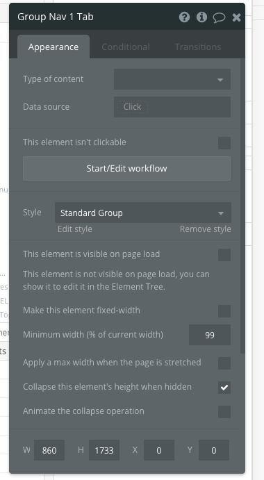
For each block, go to the Conditional tab and add a conditional statement for when to show the block: var - tab url parameter's text is Group Nav 7/8/9/10 or 11's tab's text then This group is visible
