Canvas Documentation
Bubble Best Practices
v6.0
v6.0
  • Introduction
  • Key Features
  • What's New
  • Canvas Design System Figma File
  • CANVAS FUNCTIONALITY
    • Getting Started
    • Branding & Design
    • Marketing Pages
    • Page
    • Bubble Pages & Blocks
    • Roles & Permissions
    • Menus & Navigation
    • Data & Workflows
    • Emails & Alerts
      • Mail merge terms
    • Miscellaneous
      • Setting up two factor authentication
      • Cookie and consent banner
      • Setting your password policy
      • Set up Payment info on Account page
      • Loading screen
      • Configuring multiple languages
      • Customizing your app's portal page colors
    • Reference
      • Pages
        • Index
        • Product homepage
        • Marketplace homepage
        • SaaS homepage
        • About us
        • Pricing
        • Admin Portal
        • Account
          • Account deletion
        • Login
        • Legal
        • Reset Password
        • 404
      • Reusable elements
        • Header
        • Footer
        • Signup & Log in
        • Cookies Permission
        • Widgets
          • App security
          • Header Widgets
          • Workflow Widgets
        • Admin Portal
          • Admin analytics
          • Admin email & templates
          • Admin header & footer
          • Admin legal popups
          • Admin branding, setup checklist, and settings
          • Admin options app variables
        • Menu Focus Elements
        • Sidebar tab
      • Data types
      • Option Sets
      • Backend Workflows
      • Design standards
        • Manually Building UI
  • Canvas library
    • Updating asset RG data source
    • UI Patterns
      • Simple Dashboard Page
      • Product Marketplace Dashboard Page
      • Labor Marketplace Profile Page
      • Social Network Profile Page
      • Simple Events Search Page
      • Events Search Page
      • Ecommerce Search Page
      • Labor Marketplace Search Page
    • Page templates
      • Basic Bubble Marketing Page
      • Chat Messenger Page
      • Form Builder Page
      • Centered Profile Page
      • Left-Justified Profile Page
      • Standard page
      • Toggle Tabs Page
      • Menu Page
      • Mobile Menu Page
      • Video List Page
      • Horizontal Tabs Portal / Dashboard Page
      • Standard Portal / Dashboard Page
      • Simple Portal / Dashboard Page with Icons
      • Double Sidebar Portal Page Template
      • Search Page
      • Map Search Page with Toggle and Filters
      • Floating Map Search Page
      • Search Bar Page
      • Multi-Step Page With Progress Bar
      • Standard Multi-Step Process Page
      • Multi-Step Process Page with Sidebar
      • Gallery Profile or Product Page
      • Sidebar Profile Page with Tabs
      • 2-Column Menu Tabs Page
      • 2-Column Checkout Page
      • 2-Column Video Chat Page
      • Vertical Multi-Step Page Template
    • Blocks
      • Pagination
      • Monthly Calendar Scheduling Widget
      • No Reply Comments Thread
      • Nested Comments Thread (with Like and Reply)
      • Placeholder Group
      • List with Circular Progress Bar Repeating Group
      • Top Input Chat Widget
      • Bottom Input Chat Widget
      • Toggle Tabs Group
      • Single-Select or Multi-Select Pill Tabs Group
      • Settings Group
      • Order Confirmation Group
      • To-Do List Repeating Group
      • Title Group with Button and Filters
      • Product Details Group With Progress Bar
      • Listing details with Icons and Menu Focus Group
      • Week Daily Availability Group
      • Frequently Asked Questions (FAQ) Repeating Group
      • Dismissible Module
      • Video Group
      • About Group
      • Add to Cart Group
      • Full Width Map with Directions Link
      • Location Module (Map and Directions)
      • Drag and Drop Repeating Group
      • Infinite Columns Horizontal Scroll Data Table with Fixed First Column (Repeating Group)
      • Nested Data Table (Repeating Group)
      • Standard Data Table (Repeating Group)
      • Standard Data Table (Table Element)
      • Mobile-Friendly Data Table (Repeating Group)
      • Mobile-Friendly Data Table (Table Element)
      • Infinite Columns Horizontal Scroll Data Table (Repeating Group)
      • Infinite Columns Horizontal Scroll Data Table (Table Element)
      • Activity Feed
      • Social Feed
      • Nested Repeating Group
      • Advanced Form Inputs Group
      • Reviews with Ratings Summary and Images
      • Reviews Repeating Group with User Images
      • Reviews (Text Only) Repeating Group
      • Standard Repeating Group with Image
      • Search Bar Group
      • Listing Details Group
      • Post Group with Upvoting UI
      • Large Chart Dashboard Widget
      • Chart With Key Metrics Dashboard Widget
      • 2-Column Table and Key Metrics Dashboard Widgets
      • 2-Column Large Metrics Dashboard Widgets
      • 4-Column Large Metrics Dashboard Widgets
      • Main Image with Thumbnails
      • Centered Profile Block
      • Left-justified Profile Block
      • Tile Image Gallery and Popup
      • Image Feed with Nested Comments Thread
      • 1-Column Standard Form Inputs Group
      • 2-Column Slideshow Tiles Repeating Group
      • 2-Column Repeating Group (Text, Link, Image, and Description)
      • 2-Column Repeating Group (Link, Text, and Button)
      • 2-Column Repeating Group with Actions
      • 2-Column Grid Tiles Repeating Group
      • 2-Column Form Group
      • 4-Column Tiles Repeating Group
      • Expiration timer
    • Popups
      • Edit Drawer
      • Map Location Details Drawer
      • Details and Comments Drawer
      • Confirmation Popup
      • Message Popup
      • Image Popup
      • Video Popup
      • Vertical Scroll Popup
      • Permissions popup
      • Multimedia Slideshow Popup
      • Edit Popup
      • Standard Form Popup
      • Subscribe Popup
      • Feedback / Contact Popup
      • Details Popup
      • Add List Popup
      • Advanced Form Popup
      • Rating Popup
      • Toggle Tabs Popup
      • Share Popup
      • Multi-Step Popup
      • Invoice Popup
      • Stripe Credit Card Purchase Popup
      • View Profile Popup
      • Send Message Popup
      • Multi-Select Pill Tabs Popup
      • Net Promoter Score (NPS) Popup
      • Pricing Plans Popup
    • Reusables
      • Multimage uploader
      • Sidebar_icontab
      • Doublesidebar_tab
Powered by GitBook
On this page
  • Overview
  • Structure
  • How to set up

Was this helpful?

  1. Canvas library
  2. Page templates

Basic Bubble Marketing Page

PreviousPage templatesNextChat Messenger Page

Was this helpful?

Overview

This page includes 3 marketing blocks built with Bubble elements. You can add more marketing blocks to the page by opening the Canvas extension > going to Blocks > Filtering on marketing blocks.

Structure

  • Page You can easily change the page background to one of our free svg backgrounds.

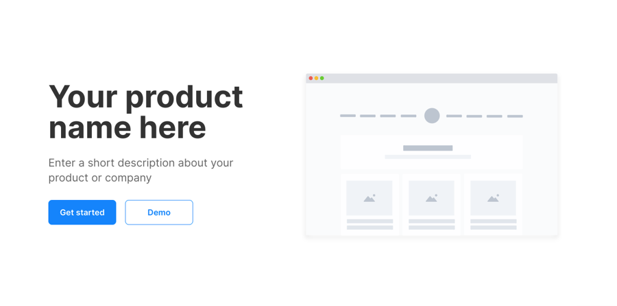
  • Group Main hero blocks This is the first block that users will see when they visit your website. This section should summarize what your website is about in a few sentences and include call to action buttons. This block includes a Group Collapsible Standard SearchBar that you can unhide by checking the box for 'This element is visible on page load'.
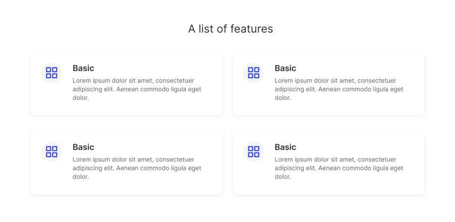
  • Group Main 2 column feature blocks This is block allows you to feature a list of items. Each item includes an icon, title, and description.
  • Group Main call to action block This block features a centered description text and two buttons.

This page also includes a popup and a reusable element:

  • Popup Hidden Variables contains four groups:

    • var - app settings This group stores the app settings object (e.g., app name, primary color, and etc.)

    • var - marketing page id (do not delete) This allows the Canvas extension to identify the page as a marketing page and to filter the extension blocks to show only marketing blocks

    • var - app variables This group stores the app variables object

    • var - dummy A placeholder group in case you want to use any hidden variable groups later.

How to set up

Changing your page background

  • By default, the page will come with a few placeholder conditional statements. You should save the SVG backgrounds here for later use.

  • To use one of these backgrounds, simply toggle to the 'Appearance' tab and copy and paste the image settings from the 'Conditional' tab over.

  • To change the colors in the svg background, you would need to have a program that supports this format (e.g., Sketch app or Adobe illustrator).

Updates to older versions of the template

  • Please check your Canvas Base Template version by going to your Bubble editor > Data tab > App data tab > All websites table > Click to view the website entry and the Template version field. If your template version is not 3.3.3 or later then please add the following state and workflows:

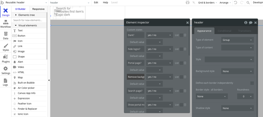
    • Go to the header reusable and add a custom state called 'Remove background?' (yes/no)
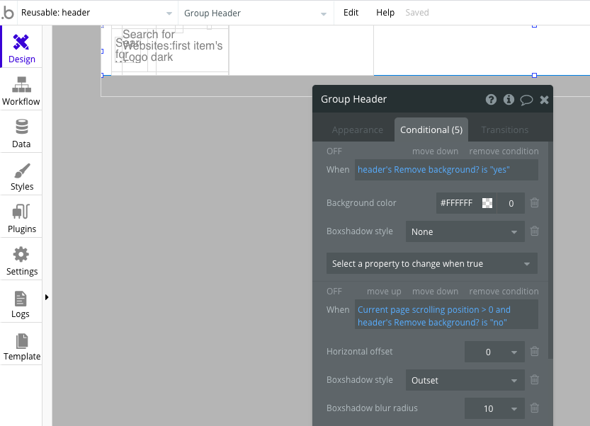
    • Select Group Header and make the following changes to the conditional tab: Add a new conditional when header's Remove background? is "yes" then change background color opacity to 0 and set boxshadow style to "None". Modify the conditional statement when Current page scrolling position > 0 by adding and header's Remove background? is "no".
Show or hide a block

  • To show or hide a block, simply click on the main group and check or uncheck the box for 'This element is visible on page load'.

  • Update the data source of repeating groups in the features list blocks

  • Update the image and text content in the blocks and add workflows to buttons

Header
Footer