Canvas Documentation
Bubble Best Practices
v6.0
v6.0
  • Introduction
  • Key Features
  • What's New
  • Canvas Design System Figma File
  • CANVAS FUNCTIONALITY
    • Getting Started
    • Branding & Design
    • Marketing Pages
    • Page
    • Bubble Pages & Blocks
    • Roles & Permissions
    • Menus & Navigation
    • Data & Workflows
    • Emails & Alerts
      • Mail merge terms
    • Miscellaneous
      • Setting up two factor authentication
      • Cookie and consent banner
      • Setting your password policy
      • Set up Payment info on Account page
      • Loading screen
      • Configuring multiple languages
      • Customizing your app's portal page colors
    • Reference
      • Pages
        • Index
        • Product homepage
        • Marketplace homepage
        • SaaS homepage
        • About us
        • Pricing
        • Admin Portal
        • Account
          • Account deletion
        • Login
        • Legal
        • Reset Password
        • 404
      • Reusable elements
        • Header
        • Footer
        • Signup & Log in
        • Cookies Permission
        • Widgets
          • App security
          • Header Widgets
          • Workflow Widgets
        • Admin Portal
          • Admin analytics
          • Admin email & templates
          • Admin header & footer
          • Admin legal popups
          • Admin branding, setup checklist, and settings
          • Admin options app variables
        • Menu Focus Elements
        • Sidebar tab
      • Data types
      • Option Sets
      • Backend Workflows
      • Design standards
        • Manually Building UI
  • Canvas library
    • Updating asset RG data source
    • UI Patterns
      • Simple Dashboard Page
      • Product Marketplace Dashboard Page
      • Labor Marketplace Profile Page
      • Social Network Profile Page
      • Simple Events Search Page
      • Events Search Page
      • Ecommerce Search Page
      • Labor Marketplace Search Page
    • Page templates
      • Basic Bubble Marketing Page
      • Chat Messenger Page
      • Form Builder Page
      • Centered Profile Page
      • Left-Justified Profile Page
      • Standard page
      • Toggle Tabs Page
      • Menu Page
      • Mobile Menu Page
      • Video List Page
      • Horizontal Tabs Portal / Dashboard Page
      • Standard Portal / Dashboard Page
      • Simple Portal / Dashboard Page with Icons
      • Double Sidebar Portal Page Template
      • Search Page
      • Map Search Page with Toggle and Filters
      • Floating Map Search Page
      • Search Bar Page
      • Multi-Step Page With Progress Bar
      • Standard Multi-Step Process Page
      • Multi-Step Process Page with Sidebar
      • Gallery Profile or Product Page
      • Sidebar Profile Page with Tabs
      • 2-Column Menu Tabs Page
      • 2-Column Checkout Page
      • 2-Column Video Chat Page
      • Vertical Multi-Step Page Template
    • Blocks
      • Pagination
      • Monthly Calendar Scheduling Widget
      • No Reply Comments Thread
      • Nested Comments Thread (with Like and Reply)
      • Placeholder Group
      • List with Circular Progress Bar Repeating Group
      • Top Input Chat Widget
      • Bottom Input Chat Widget
      • Toggle Tabs Group
      • Single-Select or Multi-Select Pill Tabs Group
      • Settings Group
      • Order Confirmation Group
      • To-Do List Repeating Group
      • Title Group with Button and Filters
      • Product Details Group With Progress Bar
      • Listing details with Icons and Menu Focus Group
      • Week Daily Availability Group
      • Frequently Asked Questions (FAQ) Repeating Group
      • Dismissible Module
      • Video Group
      • About Group
      • Add to Cart Group
      • Full Width Map with Directions Link
      • Location Module (Map and Directions)
      • Drag and Drop Repeating Group
      • Infinite Columns Horizontal Scroll Data Table with Fixed First Column (Repeating Group)
      • Nested Data Table (Repeating Group)
      • Standard Data Table (Repeating Group)
      • Standard Data Table (Table Element)
      • Mobile-Friendly Data Table (Repeating Group)
      • Mobile-Friendly Data Table (Table Element)
      • Infinite Columns Horizontal Scroll Data Table (Repeating Group)
      • Infinite Columns Horizontal Scroll Data Table (Table Element)
      • Activity Feed
      • Social Feed
      • Nested Repeating Group
      • Advanced Form Inputs Group
      • Reviews with Ratings Summary and Images
      • Reviews Repeating Group with User Images
      • Reviews (Text Only) Repeating Group
      • Standard Repeating Group with Image
      • Search Bar Group
      • Listing Details Group
      • Post Group with Upvoting UI
      • Large Chart Dashboard Widget
      • Chart With Key Metrics Dashboard Widget
      • 2-Column Table and Key Metrics Dashboard Widgets
      • 2-Column Large Metrics Dashboard Widgets
      • 4-Column Large Metrics Dashboard Widgets
      • Main Image with Thumbnails
      • Centered Profile Block
      • Left-justified Profile Block
      • Tile Image Gallery and Popup
      • Image Feed with Nested Comments Thread
      • 1-Column Standard Form Inputs Group
      • 2-Column Slideshow Tiles Repeating Group
      • 2-Column Repeating Group (Text, Link, Image, and Description)
      • 2-Column Repeating Group (Link, Text, and Button)
      • 2-Column Repeating Group with Actions
      • 2-Column Grid Tiles Repeating Group
      • 2-Column Form Group
      • 4-Column Tiles Repeating Group
      • Expiration timer
    • Popups
      • Edit Drawer
      • Map Location Details Drawer
      • Details and Comments Drawer
      • Confirmation Popup
      • Message Popup
      • Image Popup
      • Video Popup
      • Vertical Scroll Popup
      • Permissions popup
      • Multimedia Slideshow Popup
      • Edit Popup
      • Standard Form Popup
      • Subscribe Popup
      • Feedback / Contact Popup
      • Details Popup
      • Add List Popup
      • Advanced Form Popup
      • Rating Popup
      • Toggle Tabs Popup
      • Share Popup
      • Multi-Step Popup
      • Invoice Popup
      • Stripe Credit Card Purchase Popup
      • View Profile Popup
      • Send Message Popup
      • Multi-Select Pill Tabs Popup
      • Net Promoter Score (NPS) Popup
      • Pricing Plans Popup
    • Reusables
      • Multimage uploader
      • Sidebar_icontab
      • Doublesidebar_tab
Powered by GitBook
On this page
  • Overview
  • Structure
  • How to set up

Was this helpful?

  1. Canvas library
  2. Blocks

Bottom Input Chat Widget

Use this for all social chat messengers

PreviousTop Input Chat WidgetNextToggle Tabs Group

Was this helpful?

Overview

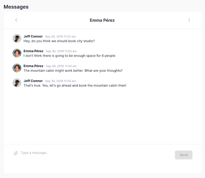
This block allows a user to manage multiple conversation threads with different users. A user can click into one of the threads and send or view messages/attachments.

Structure

When this block is added to a page, it is placed within a group called Blocks container 860 (do not rename) on the page. This group contains the responsive settings for all blocks.

  • bottominput_chat This reusable element contains all of the logic and UI for threads and messages. It contains three main groups:

    • Group Main threads list_thread This group contains the list of threads that the current user is a part of. All of the threads are displayed in RepeatingGroup t-Thread. Clicking on Group Main select thread_thread will hide Group Main threads list_thread and show the messages for the selected thread.

    • Group Main message_thread This group displays all messages between users in a thread (in RepeatingGroup t-Message). You have two versions of message formats to choose from:

      Clicking on Group Inner Back to threads will navigate back to the list of threads. The user can enter a message in MultilineInput message and attach a file by clicking on the file clip icon. When an attachment is added, it will show underneath the message input. Clicking on it will open the attachment in a new tab for previewing. Clicking on Group Inner delete file will delete the attachment and allow you upload a new attachment.

    • Popup Hidden Variables This popup includes various variables that are referenced in workflows or conditionals on the page.

      • var - Website object - This group stores the website object (e.g., app name, primary color, and etc.)

      • var - chat thread - This group stores the thread that the user is currently viewing.

      • var - user viewing chat - This group stores the user information (current user who is viewing the thread and messages).

      • var - attached msg file - This group temporarily stores a file that the current user attaches to a message (this group will be reset when the message is sent).

How to set up

Customizing the chat layout by going to the bottominput_chat reusable element

  • In Popup Hidden Variables, update var - user viewing chat's data source to include any filters for the user who is viewing the chart

  • Select a message format by showing Group Collapsible iMsg_message or Group Collapsible Slack_message. Hide the format that you are not using.

  • [Optional] Change the iMessage format colors. You can do this by locating the HTML message styles in the reusable element and updating the hex color codes. From-me styles will apply to all messages sent by you (current user). From-them styles will apply to all messages sent by the other user(s).

Make sure you save the original code before you change the hex color codes in HTML message styles. Sometimes it takes a few page loads to see the html updates on the page. You can preview the updated html styles by doing a hard refresh in the chrome browser (Command + Shift+ R).

Adding the bottom chat widget reusable to different pages in your app

In Bubble, a reusable element is a way to build elements that you can replicate in more than one page without having to recreate them.

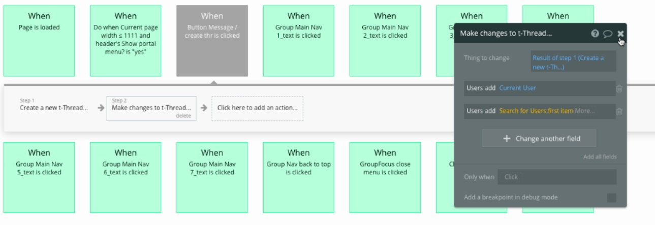
  • On the page that you have your chat widget instance, set up a workflow to create a new thread and add the user(s) to the thread.

    • For example, you might add a Message user button to the page and include the following workflows:

  • The bottominput_chat instance has a data type of type t-Thread. To display all of the current user's threads that he or she is a part of, do not set a thread data source. However, if you want to display only one thread for a user (i.e, hiding the threads list view and only showing the thread conversation view, then you should pass a thread to the reusable instance).

iMessage format This is the default message format. To hide this style, select Group Collapsible iMsg_message and uncheck the box for This element is visible on page load.

Slack format To use this style, hide Group Collapsible iMsg_message and show Group Collapsible Slack_message by checking the box for This element is visible on page load.

For more information on how to use hidden variables, click .

You would want to keep the data source for this group here to Current user and remove the conditional statement (Do a search for users:first item is a placeholder for demo purposes).

here
Create a new thread
Add the users to the thread. The second user is for demo purposes and should be whoever the current user is messaging.