Canvas Documentation
Bubble Best Practices
v6.0
v6.0
  • Introduction
  • Key Features
  • What's New
  • Canvas Design System Figma File
  • CANVAS FUNCTIONALITY
    • Getting Started
    • Branding & Design
    • Marketing Pages
    • Page
    • Bubble Pages & Blocks
    • Roles & Permissions
    • Menus & Navigation
    • Data & Workflows
    • Emails & Alerts
      • Mail merge terms
    • Miscellaneous
      • Setting up two factor authentication
      • Cookie and consent banner
      • Setting your password policy
      • Set up Payment info on Account page
      • Loading screen
      • Configuring multiple languages
      • Customizing your app's portal page colors
    • Reference
      • Pages
        • Index
        • Product homepage
        • Marketplace homepage
        • SaaS homepage
        • About us
        • Pricing
        • Admin Portal
        • Account
          • Account deletion
        • Login
        • Legal
        • Reset Password
        • 404
      • Reusable elements
        • Header
        • Footer
        • Signup & Log in
        • Cookies Permission
        • Widgets
          • App security
          • Header Widgets
          • Workflow Widgets
        • Admin Portal
          • Admin analytics
          • Admin email & templates
          • Admin header & footer
          • Admin legal popups
          • Admin branding, setup checklist, and settings
          • Admin options app variables
        • Menu Focus Elements
        • Sidebar tab
      • Data types
      • Option Sets
      • Backend Workflows
      • Design standards
        • Manually Building UI
  • Canvas library
    • Updating asset RG data source
    • UI Patterns
      • Simple Dashboard Page
      • Product Marketplace Dashboard Page
      • Labor Marketplace Profile Page
      • Social Network Profile Page
      • Simple Events Search Page
      • Events Search Page
      • Ecommerce Search Page
      • Labor Marketplace Search Page
    • Page templates
      • Basic Bubble Marketing Page
      • Chat Messenger Page
      • Form Builder Page
      • Centered Profile Page
      • Left-Justified Profile Page
      • Standard page
      • Toggle Tabs Page
      • Menu Page
      • Mobile Menu Page
      • Video List Page
      • Horizontal Tabs Portal / Dashboard Page
      • Standard Portal / Dashboard Page
      • Simple Portal / Dashboard Page with Icons
      • Double Sidebar Portal Page Template
      • Search Page
      • Map Search Page with Toggle and Filters
      • Floating Map Search Page
      • Search Bar Page
      • Multi-Step Page With Progress Bar
      • Standard Multi-Step Process Page
      • Multi-Step Process Page with Sidebar
      • Gallery Profile or Product Page
      • Sidebar Profile Page with Tabs
      • 2-Column Menu Tabs Page
      • 2-Column Checkout Page
      • 2-Column Video Chat Page
      • Vertical Multi-Step Page Template
    • Blocks
      • Pagination
      • Monthly Calendar Scheduling Widget
      • No Reply Comments Thread
      • Nested Comments Thread (with Like and Reply)
      • Placeholder Group
      • List with Circular Progress Bar Repeating Group
      • Top Input Chat Widget
      • Bottom Input Chat Widget
      • Toggle Tabs Group
      • Single-Select or Multi-Select Pill Tabs Group
      • Settings Group
      • Order Confirmation Group
      • To-Do List Repeating Group
      • Title Group with Button and Filters
      • Product Details Group With Progress Bar
      • Listing details with Icons and Menu Focus Group
      • Week Daily Availability Group
      • Frequently Asked Questions (FAQ) Repeating Group
      • Dismissible Module
      • Video Group
      • About Group
      • Add to Cart Group
      • Full Width Map with Directions Link
      • Location Module (Map and Directions)
      • Drag and Drop Repeating Group
      • Infinite Columns Horizontal Scroll Data Table with Fixed First Column (Repeating Group)
      • Nested Data Table (Repeating Group)
      • Standard Data Table (Repeating Group)
      • Standard Data Table (Table Element)
      • Mobile-Friendly Data Table (Repeating Group)
      • Mobile-Friendly Data Table (Table Element)
      • Infinite Columns Horizontal Scroll Data Table (Repeating Group)
      • Infinite Columns Horizontal Scroll Data Table (Table Element)
      • Activity Feed
      • Social Feed
      • Nested Repeating Group
      • Advanced Form Inputs Group
      • Reviews with Ratings Summary and Images
      • Reviews Repeating Group with User Images
      • Reviews (Text Only) Repeating Group
      • Standard Repeating Group with Image
      • Search Bar Group
      • Listing Details Group
      • Post Group with Upvoting UI
      • Large Chart Dashboard Widget
      • Chart With Key Metrics Dashboard Widget
      • 2-Column Table and Key Metrics Dashboard Widgets
      • 2-Column Large Metrics Dashboard Widgets
      • 4-Column Large Metrics Dashboard Widgets
      • Main Image with Thumbnails
      • Centered Profile Block
      • Left-justified Profile Block
      • Tile Image Gallery and Popup
      • Image Feed with Nested Comments Thread
      • 1-Column Standard Form Inputs Group
      • 2-Column Slideshow Tiles Repeating Group
      • 2-Column Repeating Group (Text, Link, Image, and Description)
      • 2-Column Repeating Group (Link, Text, and Button)
      • 2-Column Repeating Group with Actions
      • 2-Column Grid Tiles Repeating Group
      • 2-Column Form Group
      • 4-Column Tiles Repeating Group
      • Expiration timer
    • Popups
      • Edit Drawer
      • Map Location Details Drawer
      • Details and Comments Drawer
      • Confirmation Popup
      • Message Popup
      • Image Popup
      • Video Popup
      • Vertical Scroll Popup
      • Permissions popup
      • Multimedia Slideshow Popup
      • Edit Popup
      • Standard Form Popup
      • Subscribe Popup
      • Feedback / Contact Popup
      • Details Popup
      • Add List Popup
      • Advanced Form Popup
      • Rating Popup
      • Toggle Tabs Popup
      • Share Popup
      • Multi-Step Popup
      • Invoice Popup
      • Stripe Credit Card Purchase Popup
      • View Profile Popup
      • Send Message Popup
      • Multi-Select Pill Tabs Popup
      • Net Promoter Score (NPS) Popup
      • Pricing Plans Popup
    • Reusables
      • Multimage uploader
      • Sidebar_icontab
      • Doublesidebar_tab
Powered by GitBook
On this page
  • Overview
  • Structure
  • How to set up

Was this helpful?

  1. Canvas library
  2. Blocks

Expiration timer

Use this group to instill a sense of urgency and to nudge the user to complete a certain action.

Previous4-Column Tiles Repeating GroupNextPopups

Was this helpful?

Overview

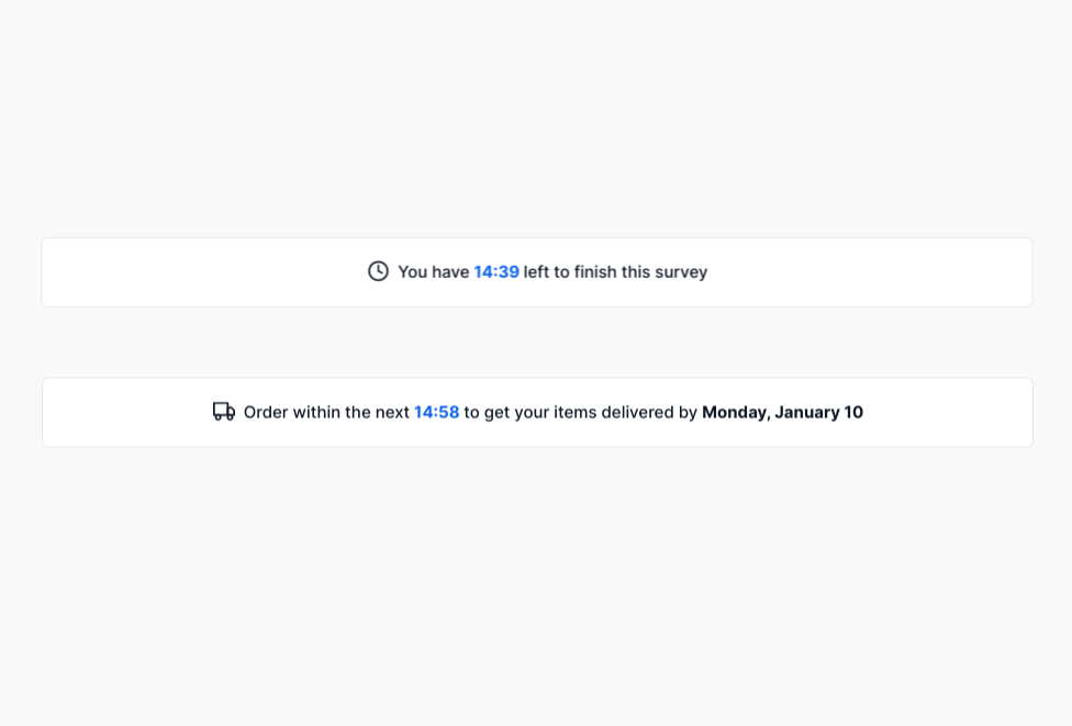
This block contains two UIs — one for form expiration and the other for shipping expiration. When the block is visible on page load, the countdown timer will start. When the timer is up, the user will see an expiration message.

Structure

  • When this block is added to a page, it is placed within a group called Blocks container 860 (do not rename) on the page. This group contains the responsive settings for all blocks.

  • This Group Expiration timer block contains the following groups:

    • Group main counter that includes:

      • Countdown time This is the counter element from the Timer Free plugin. You will set the timer value here and indicate when the form or cart will expire. Please note that this element needs to always be visible on page load.

      • Group Collapsible form expiry This group includes the UI for form/survey expiration.

      • Group Collapsible shipping expiry This group includes the UI for shipping expiration.

      • Group PLACEHOLDER that you can resize in case you need to add more elements to the block.

How to set up

  • Select a group to display: Group Collapsible form expiry or Group Collapsible shipping expiry. Hide the group that you are not using by unchecking the box for This element is visible on page load.

This block uses the . Please ensure you have this plugin installed in your app.

A that is collapsed by default

Select Countdown time and enter when you want the timer to stop. For example, in the image below the timer is set to stop after 15 minutes. Please do not remove the +(seconds):2 logic here since it is used as a buffer to account for the initial page load time and to ensure that the timer starts and displays 15 minutes. Depending on your page load speed, you may need to modify this value.

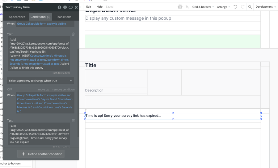
Select the text element in the group you've selected above, go to the conditional tab, and edit the message to display during countdown and when the timer is up.
Timer Free plugin
Group main header section