Horizontal Tabs Portal / Dashboard Page
Use this for dashboards that require only one-level menu navigation
Use this for dashboards that require only one-level menu navigation
This dashboard / portal page includes a sticky top bar with different sections: page-level tabs for toggling between content groups, a more menu dropdown, link, toggle, search input, and buttons. Ideal for dashboards where users need to be able to quickly access different types of content on the same page. On mobile, the tabs will be horizontally scrollable.
For simple dashboards, utilize the page-level horizontal tabs to showcase important tabs. Secondary tabs can be nested under the more menu dropdown.
For more complex dashboards that may require subtabs, utilize the main content group area and add vertical tabs or content-level horizontal tabs to further breakdown the page.
When this page is added to your app, it will come with three main groups:
FloatingGroup Horizontal tabs
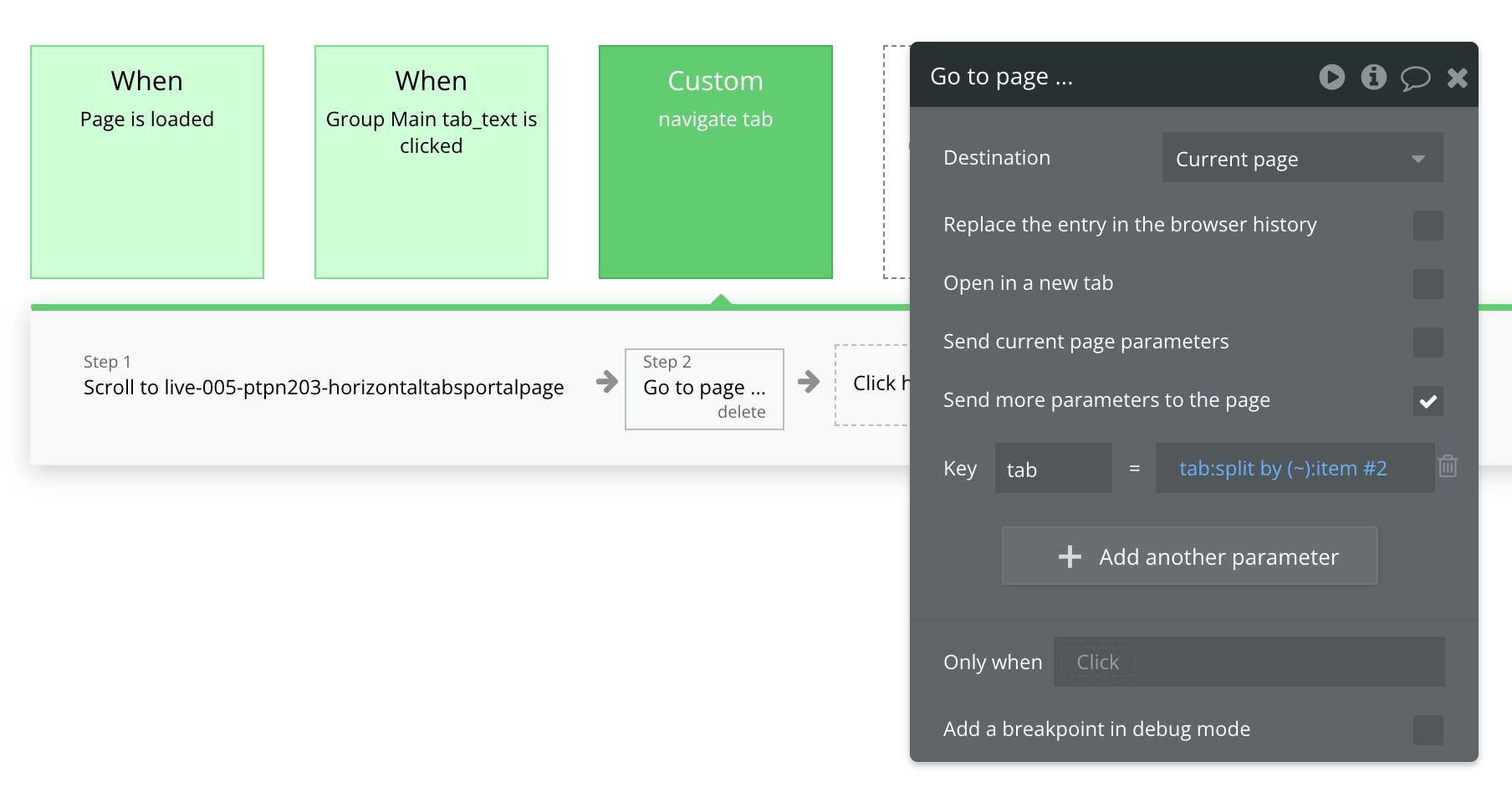
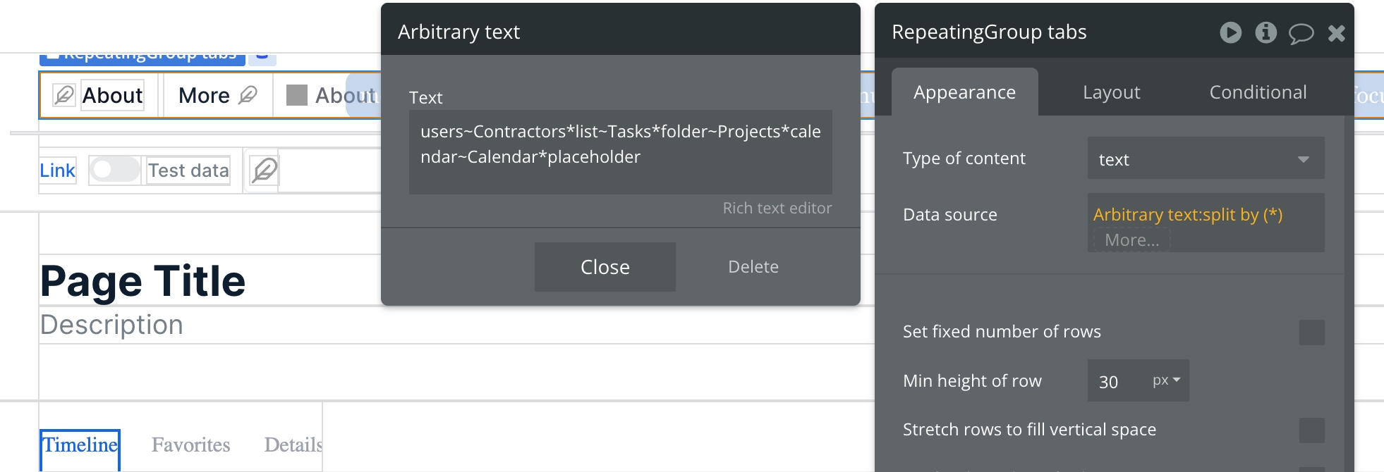
RepeatingGroup tabs is used to display a list of page-level tabs, including the menufocus_sections_template reusable element (more menu dropdown). For demo purpose, we're using Arbitrary text as the repeating group's data source. Clicking on Group Main tab_text will trigger the navigate tab custom workflow.
Group Inner other actions contains various UI components such as a link, toggle, search input, and buttons. Hide or unhide these elements by checking/unchecking the box for This element is visible on page load in the layout tab.
Group main content - Paste group This group contains the responsive settings for all additional blocks added to the page.
Popup Hidden Variables
This popup includes various variables that are referenced in workflows or conditionals on the page.
var - ⚙️ app settings - This group stores the App settings (e.g., app name, primary color, and etc.)
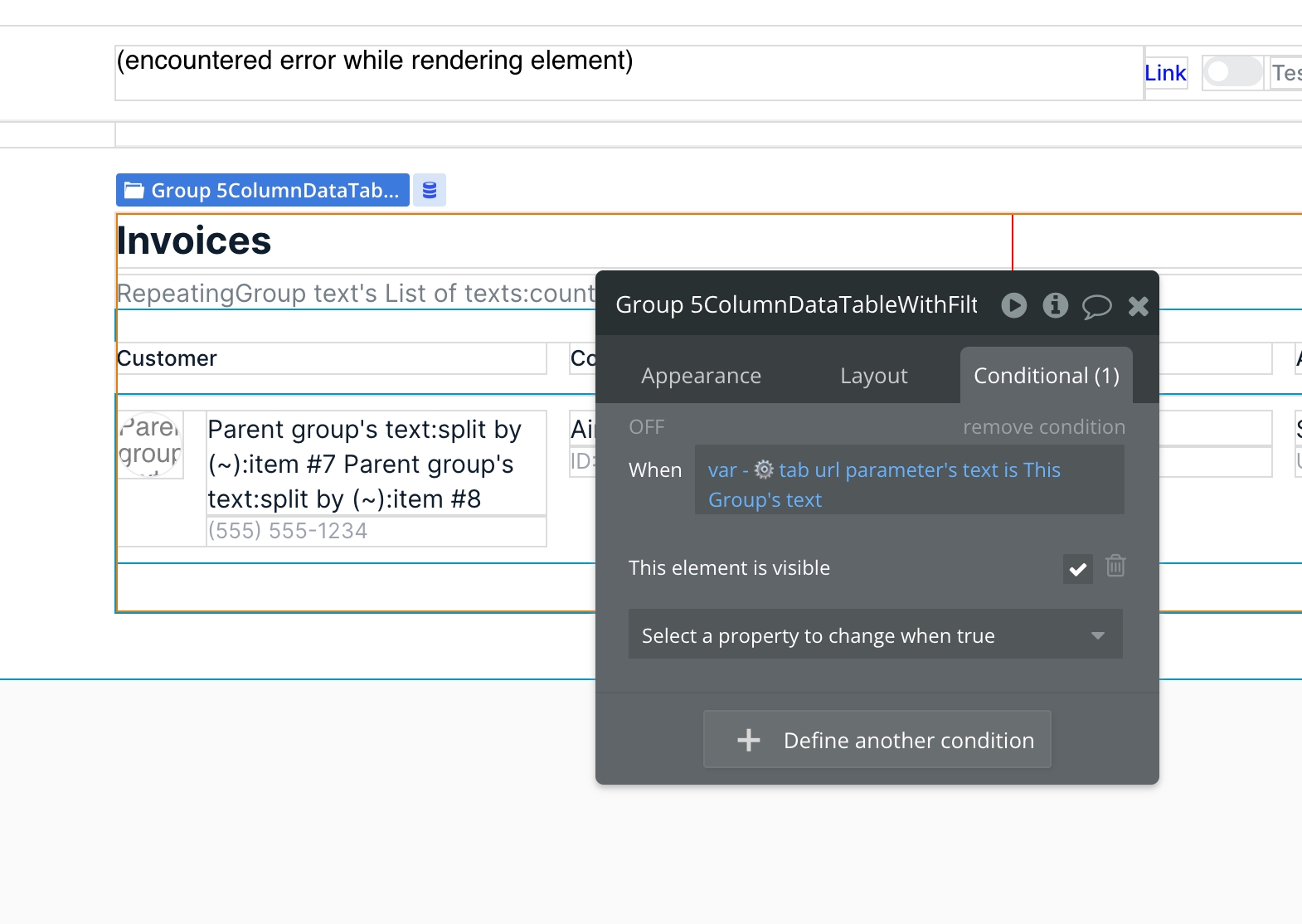
⚙️ var - tab url parameter - This group stores the url parameter for tab.
var - placeholder - This is a placeholder group for users to add their own variable.
This page will also include a menufocus_sections_template reusable template.
There's various ways that you can set up the data source for the tabs repeating group. If you want your navigational tabs to be dynamic, you making consider updating the data source and linking it to an existing app data type or creating a new tabs option set. For demo purpose, we use Arbitrary text as the data source which works well when you have static tabs.
As a refreasher, Arbitrary text allows us to pass a string of text that is concatenated and :split by allows us to define a delimiter to separate the text string. Using this method, we can generate dummy content for the repeating group without referencing any app data types.
In the above example, we are passing the tab structure as a text string:
[feather icon type name]~[tab name]
~ denotes a field in a single entry and * denotes a new entry
At the end of the text string you see "*placeholder" which is used to display the more menu dropdown in the repeating group.
When you click on a tab, it will trigger the navigate tab custom workflow (with a tab parameter of type text that you pass when triggered). This will update the page url to website.com/page?tab=tab-name.
If you're using arbitrary text as the data source, the current text that you pass will look like users~Contractors but we do not want to include the feather icon name in the url tab parameter so we filter that out by split by (~):item #2. The workflow evaluates the text string like this:
item #1: users
item #2: Contractors
If you're not using Arbitrary text as the data source for the repeating group, you may want to tweak the workflows. Or, if you're not using icons in your tabs, you can have your repeating group Arbitrary text structured like this:
Contractors*Tasks*Projects*Calengar*placeholder
Then, in the workflows and conditional statements, you'll remove any split by(~):item# references.
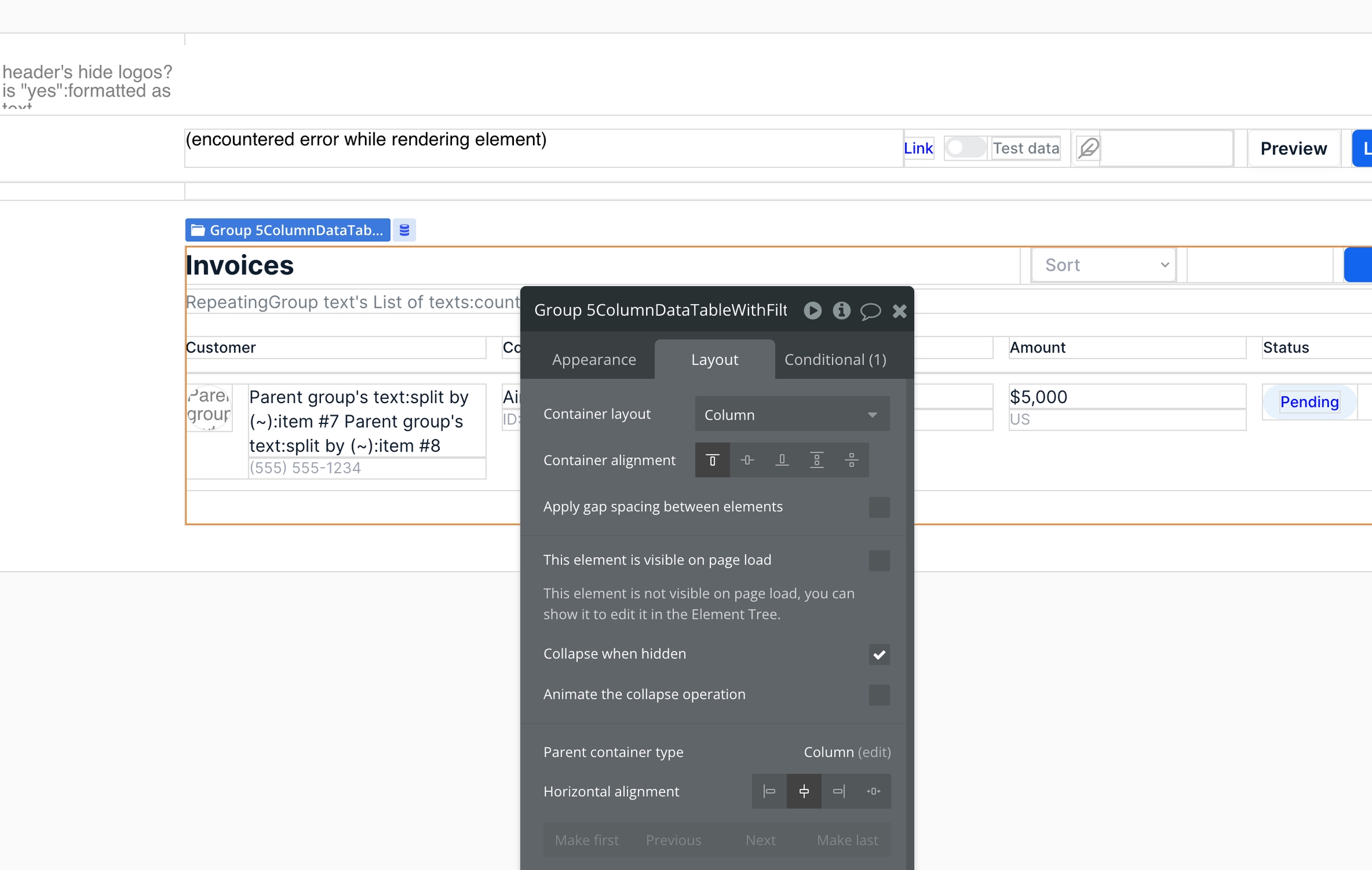
On the layout tab, uncheck the box for This element is visible on page load.
Set the block's type to text and store the content block tab's name (either as static text or referencing some dynamic text like an Option set).
Add a conditional statement to display the content group when the page tab url parameter matches the content group's tab name.

