Header Widgets
Header widgets are prebuilt into the Canvas header and can be displayed by setting up the correct actions on your header link.
Overview
Element name: widget_icon_actions
Name
Purpose
Badge
Notifications
Shows a list of app notifications
Yes
Search
Shows a global search input and dropdown
No
Shopping Cart
Shows a list of items in shopping cart
Yes
Messages
Shows a list of messages
Yes

There are currently four header widgets for Search, Shopping Cart, Messages, and Notifications that can be used and customized. All of these widgets (except the search) have the ability to display a numeric badge as shown below
Show widgets in the header
These widgets are already preconfigured in the Canvas header. You can set these up using an action when adding icons to any header. See how to do that here.
Setting up the badge
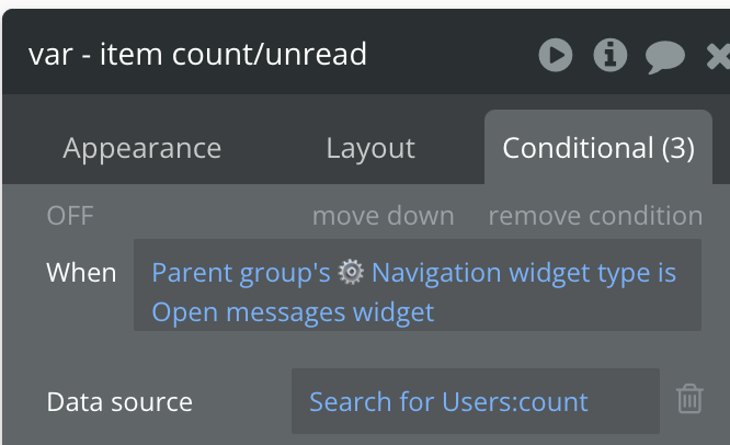
To set up the badge value, open the widget_icon_actions reusable element and find a group called var - item count/unread. Go to the conditional tab to see placeholder conditional statements.
For example, if you want to display the unread messages count for a user, you'd need to update the conditional statement for 'Open messages widget' to a dynamic value that represents a number of things for the current user.

Specific element details
Notifications
Group name: Group Notifications Purpose: Display notifications to your users
This element contains a simple user interface for displaying unread messages or notifications. To use this UI, please replace all dummy data type with the data type you want to display (e.g., Messages or Notifications).
Add workflows to Button Mark as read, Group Select message, and Group view more.
Search
Group name: Group Search Purpose: Provide a convenient location for your users to search and view results
This focus group reusable element contains a simple user interface for searching for things. To use this UI, please replace all dummy data type with the data type you want to display (e.g., Files or products).
Add workflows to Group Select item and update data source of RepeatingGroup text.
Shopping Cart
Group name: Group Cart Purpose: Display the items in the user's cart for easy review and checkout
This focus group reusable element contains a simple user interface for reviewing the items in your cart. To use this UI, please replace all dummy data type with the data type you want to display (e.g., Product or Cart items).
Add workflows to Button remove and Button Checkout.
Messages
Group name: Group Messages Purpose: Display a list of unread messages for the user
To use this UI, please replace all dummy data type with the data type you want to display (e.g., messages).
Add workflows to Group view more and Button Mark as read.
Was this helpful?