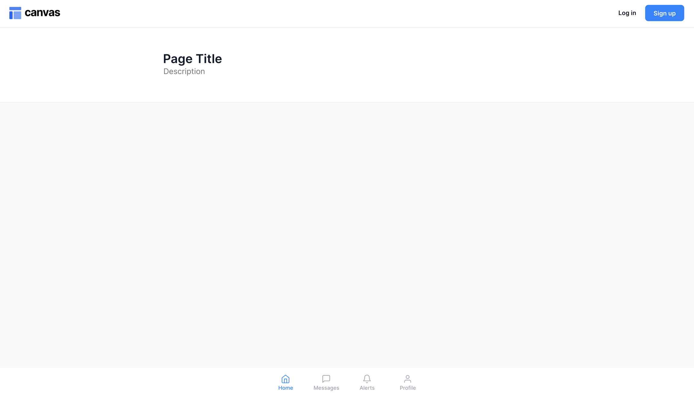
Mobile Menu Page
Use this for mobile-first apps and pages.
Overview

Standard one column page layout where multiple modules can be stacked on top of each other (they should not be overlapping). This page includes a bottom navigation menu that is optimized for use on mobile. The menu displays four destinations and each destination is represented by an icon and an optional text label. When a bottom navigation icon is tapped, the user is taken to the top-level navigation destination associated with that icon. Please ensure that you have installed the Feather Icon plugin to your app before submitting your page request.
Structure
When this page is added to your app, it will come with one main group:
Blocks container 860 (do not rename) This group contains the responsive settings for all blocks on the page. Any new blocks should be added to this group.
This page comes with one popup:
Popup Hidden Variables contains two groups:
var - Website object This group stores the website object (e.g., app name, primary color, and etc.)
var - dummy data A placeholder group in case you want to use any hidden variable groups later.
This page will also come with two reusable elements: header and bottommenu.
The bottommenu reusable element comes with four tabs
Clicking on a tab will trigger a custom workflow called Set tab number
The custom workflow will set a number state on bottommenu (this captures which tab the user is currently viewing)
The reusable element also includes a Popup Hidden Variables
var - toggle tabs stores bottommenu's
numberstate
How to set up
If you add more blocks to the page, please resize Group PLACEHOLDER so that it is not overlapping with any other elements (for responsiveness).
[Optional] Update page title and description content.
Add blocks to the page using our Canvas chrome extension. These new blocks should be add into Blocks container 860 (do not rename).
By default, the blocks should be hidden on page load (uncheck the box for This element is visible on page load for each block)
Check the box for Collapse this element's height when hidden

To show or hide blocks, add conditional statements to each block:
For the first block, add a conditional statement like this:
When bottommenu's Tab is empty or bottommenu's Tab is 1then This element is visible
For blocks after the first block, add the following conditional statements:
When bottommenu's Tab is 2 then This element is visible
When bottommenu's Tab is 3 then This element is visible
and so on...
To ensure the FloatingGroup Bottom menu shows up at the bottom of your page, you need to align the bottom of the floating group to the bottom of the page.

Was this helpful?