Sidebar_icontab
Reusable name: sidebar_icontab
Overview: Used as sidebar tabs in Simple Portal / Dashboard Page with Icons and Double Sidebar Portal page templates. You can copy and paste an existing sidebar_icontab and define the reusable element properties below:
Icon Tab feather icon
Tab text Tab name (e.g. Users or Data type 1 from the image above) This will be used as the tab's name and as a parameter in the url (&tab=Tab text)
Default tab color Default tab background color
Selected tab color Tab background color for a selected tab (e.g. Blue tab in image above)
Hovered tab color Tab background color for a hovered tab (e.g. Gray tab in image above)
Selected font color Font and icon color for select tab
Hovered font color Font and icon color for hovered tab
Show notifications? (yes/no) If yes, the alert dot will be visible
Show tab text? (yes/no) If yes, the Tab text will be visible in the tab. You may want this to be hidden if you are using the Double Sidebar Portal Page
Section text (text) - for Double Sidebar Portal Pages Set the section tab to navigate to when this icon tab is clicked
Subtab text (text) - for Double Sidebar Portal Pages Set the subtab to navigate to when this icon tab is clicked
Workflows: Workflows to navigate to tab, section, and subtab are included in this reusable element:
Clicking on a tab will append tab=Tab text to the url, sec=Section text, and sub=Subtab text
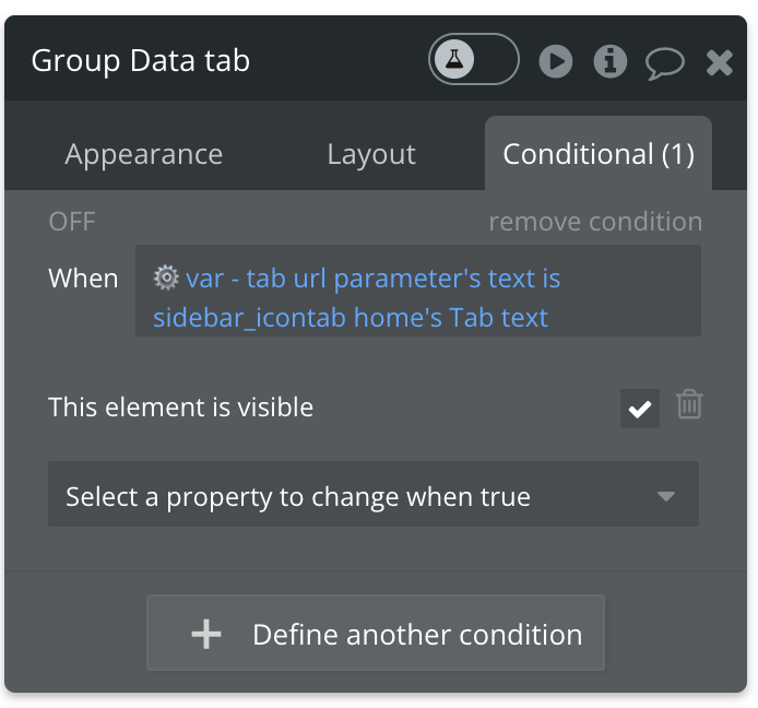
How to setup To show different content groups for each selected tab, you will add a conditional statement to the content group similar to the one below

or 'Get tab from page URL is sidebar_icontab [name]'s text'
Was this helpful?